Your comments
This sounds good so far, but this part:
- New tab will be added to the Homepage, "Favorites from people you follow", which will show a feed of images from people you follow
still got me confused. I'm sorry, but I don't get what you want to tell me. Could you please elaborate?
Also, if I publicly favorite other peoples works, will it be displayed in a favorite section, we know from other art sites, on my profile and can other users browse my favorites? Or would this still be just an internal process between artist and the one faving where the artist gets a notification?
Additionally one last thing: I'd suggest to rename "Save for Later" to something like "Save Privately" or "Store in hidden Favorites". Save for later sounds like you're still supposed to do something with the content you saved.
Good idea, but only for friends (if this feature eventually gets implemented), not for all users you follow, since that would be useless and spam your inbox. And concerning "for those who want to share their birthday", yes this should definitely be an optional thing for those people who don't want to share their birthday even with friends.
Here's a similar theme:
Nice idea, but a simple number telling you how many users are currently online won't do the job. To find the most active times of a day, you'd need some kind of graph.
I could imagine something like this to be included in the site stats, once they go live: https://support.furrynetwork.com/topics/40-site-stats/
I just found this post (https://support.furrynetwork.com/topics/564-text-color-and-website-themes/#) about adding different themes for the site, and thought, combining the issue described here for colorblind people, it would be a good idea to have one theme especially designed to support colorblind users! That way a lot of little details that make things easier for colorblind people can be changed, without affecting the way other users see the site.
I am not really familiar with that whole matter, so I ask you: Would something like this work for colorblind people?
Another thing!
Concerning the problem for colorblind people, like described in this post (https://support.furrynetwork.com/topics/271-better-differentiation-for-followfollowing-button/), there could be one theme specially designed to support colorblind users!
I'm not really sure how something like that might look like or if it would work, but a lot of things are possible these days!
This is a great idea! Having a brighter theme would be a blessing for my eyes.
In addition to the white text on dark background thing, I also have a little issue with tags and usernames (and probably a few other details) since they are blue! For you have a dark font on a dark background, which gets really annoying to the eye quickly. And several other things on the site are displayed in a faint gray font which is really hard to read sometimes! Especially for things like Submission titles, which are very important, and the way things are now make them seem like unimportant information.
The ability to switch between several default themes for the site, according to the respectable user's needs would be awesome!
I'd definitely be for a site layout change. A "Make it bigger" button feels like saying "Yeah, we know comments are important, but we're gonna hide them behind this button anyway".
Things to consider for the layout:
Comments should be separated from each other by subtle, little rulers or a boxes around them (like it is in this forum here) to keep everything clean and uncluttered. Currently they are just placed under each other without a clear separator.
The "reply" and "flag" buttons should be always visible (including both, the icon and the text), since the constant show / don't show when hovering the mouse over it and the button extending to show the attached text gets annoying.
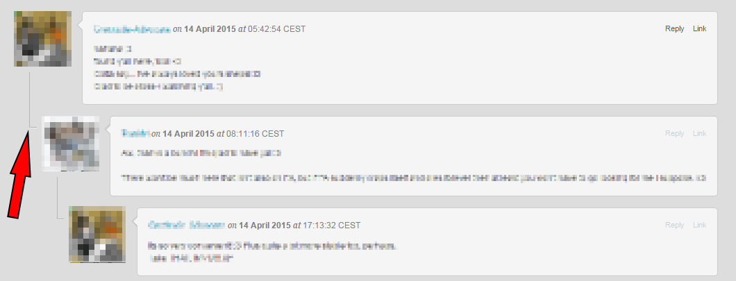
Comments that reply to another comment should show explicitly to which comment they replied. The current @mentioning thing doesn't do a very good job in my opinion, especially not for comment chains. Maybe indenting replies would work? Or connect them with thin lines to show who replied to whom, similar to the way Weasyl does it?
The date, like it is currently depicted as "3 days ago" and showing the actual date when hovering the mouse over it, is a good thing and I think it should stay that way. It makes it especially easy to understand how old a comment is if you live across different time zones or in a region that doesn't use the AM PM system.
Add an easy way to permalink to a certain comment.
Maybe highlight the comments of the user who posted the submission among the other comments by color or adding something like "created this submission" or like "wrote this journal" behind the username to easily identify the content creator between other comments.
At this point I'd also like to add that the 1000 character limit for comments should be removed. Splitting longer comments into several smaller ones is not only annoying, but also clutters the comment section up. In addition, there is no counter to show you how much space you have left to write something!
Since I'm not familiar enough with the matter to present a solution for the implementation of those ideas for mobile devices, I'll shut my mouth about it.
I hope these suggestions are something other people would like to see as well, or might give you all some more good ideas to share!
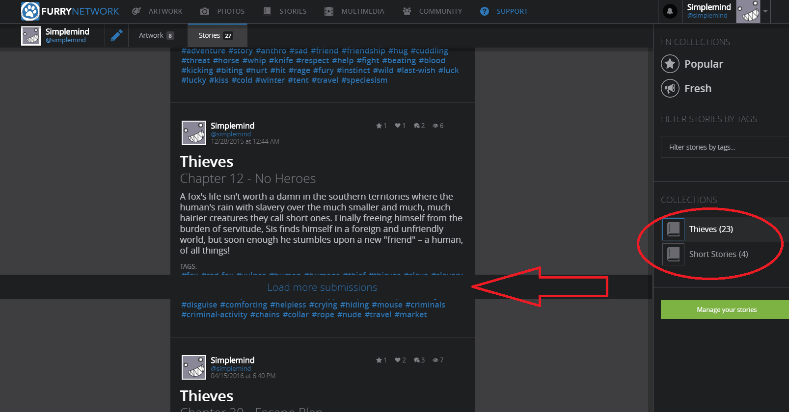
Here is a screenshot:
Customer support service by UserEcho


Archive seems like the perfect term to me, it's very intuitive. Sounds better and is shorter than 'save for later' too!