Your comments
Design shouldn't impede function. I can see why square thumbnails would be your initial reaction to having a clean looking web page, but in practice, I do not think this really works.
Here's an example of what I mean. You see several of the images have the entire heads cut off of images. Names cut in half, and the comics along the bottom are zoomed into only the middle panel, potentially spoiling a punchline. One clever artist used a thick upper and lower boarder to make their artwork square, to prevent their character's heads from getting bisected. 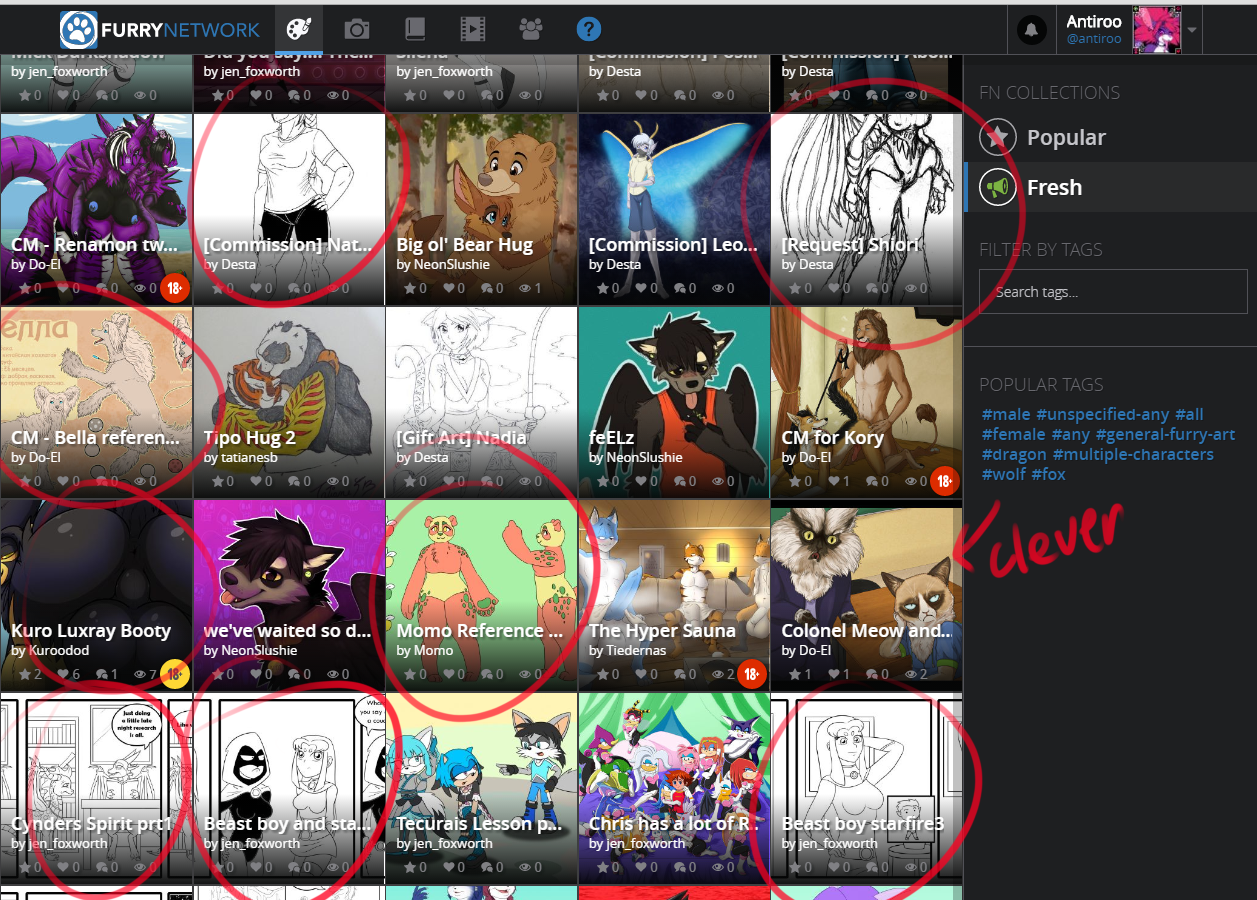
The point of the feed is to allow people to view artwork, these images are much more likely to be overlooked rather than viewed and can give the impression that the website has worse artwork than it really does.
Customer support service by UserEcho

Not really, especially if square is the default. It's a subtle but very powerful effect. People who are not used to designing compositions are unlikely to notice the effect it's having on them, and thus unlikely to switch to the non-square format.