
+14
Set thumbnails native aspect ratio rather than squares
The thumbnail is the first impression a viewer gets of a piece of artwork. There's a great deal of thought and effort that goes into creating a good composition at a distance, and this effort is usually ruined by cropping the edges to create a square thumbnail.
Additionally character shots end up with heads cropped off, and the focal point getting shifted.
This is bad for both artists and people who are seeking art, as they do not get to see the piece in it's intended form.
While this may make the webpage look cleaner, it makes the artwork contained look worse.
Customer support service by UserEcho

I think to conserve their layout while still maintaining artist aspect ratios, they should fit the image into a grid like pattern. That way each row can have the same amount of images without sacrificing what can be shown. or have artists decide what ratio they want their custom thumbs to be. I drew up a draft to explain what I meant better.
This is something an average user would have, with ratios all over the place. But it looks organic. Theres no point in micromanaging art for the sake of looking good overall if you cant appreciate the art itself.
my one problem with this is that it would make the site "which is nice and clean in design" look cluttered and unorganized. IT would end up ruining this nice professional look that FN has at the moment. .
As long as the squares around each image aren't there, It could look nice. The biggest advantage to having it be this way imo is if you're looking for a specific aspect ratio (desktop images for example), you'd know the image's native aspect ratio is just by looking at the thumbnail.
honestly this would make the site look cluttered. I really hope this doesn't go through as it's ugly :(
Weasyl's horizontal masonry-style thumbnail layout looks very clean. All the thumbnails have the same height, but variable width.
I'm glad that someone else made this thread. I was about to do it, myself.
Antiroo is absolutely right. Weasyl originally had square thumbnails just like these, and it ended up compromising the browsing experience. Changing the aspect ratio of the thumbnail bastardizes the composition, giving the viewer an inaccurate representation of the piece to be viewed. Most people don't draw in square canvases. A scaled-down version of the picture is easy enough to read at a glance, but a cropped one changes focal points and loses details. I get why people would initially implement a square grid-based thumbnail system, as it seems slick in theory, but in practice, it hurts the gallery.
I can see what NYVivian Vee and Miyuni Doxae are going for with their suggestions, but I don't believe that would be the best solution. All you have to do is take a look at Weasyl to see an elegant way to handle this. Compare it against Furry Network, and you can see that Weasyl is way easier to read. In FN, titles are lost, body parts are cropped out, and entire characters disappear from view.
Weasyl's thumbnails are dynamically resized, so that each thumbnail in a row ends up the same height, but with varying widths in order to have the entire row be justified with the left and right boundaries. I was super happy the day that got implemented, because it tremendously improved the browsing experience.
Square thumbnails hurt more than they help; FN would benefit from a dynamically-resized layout.
I use Weasyl and until now I didn't even notice they have it set up this way. I find this to also be most enjoyable to look at. This may be a separate topic, but I think it would be a wonderful addition if hovering over the thumbnail would display the height and width of the image.
Why not both approaches? As suggested above, have the tiles while look clean and unified and then hover over to see a preview in the native aspect ratio?
Yesh. That would be wonderful!
This still doesn't work for two reasons:
1. This requires manually mousing over each thumbail to see whether or not it's worth clicking on. It's an unnecessary impediment, preventing users from glancing at the thumbnails en masse and making accurate judgements.
2. This literally doesn't work on touchscreen devices. I can't do this on my phone, or my touchscreen computer monitor. Hovering doesn't exist.
Native-aspect thumbnails are a simpler and more practical approach.
Soo if the aspect ratio thumbnails and the hover over feature are both implemented, the latter for devices that can use it, then everyone wins! The least they could do is let hovering over, like Weasyl and FA, work with certain browser addons that expand the image.
Yeah, that makes sense. It would be win-win.
Yeah, huge +1 for the Flickr/Weasyl style justified image grid. Truly representative thumbnails are essential for browsing a gallery, and the fixed-width-variable-height grid is by far the nicest way I've seen of handling this.
Design shouldn't impede function. I can see why square thumbnails would be your initial reaction to having a clean looking web page, but in practice, I do not think this really works.
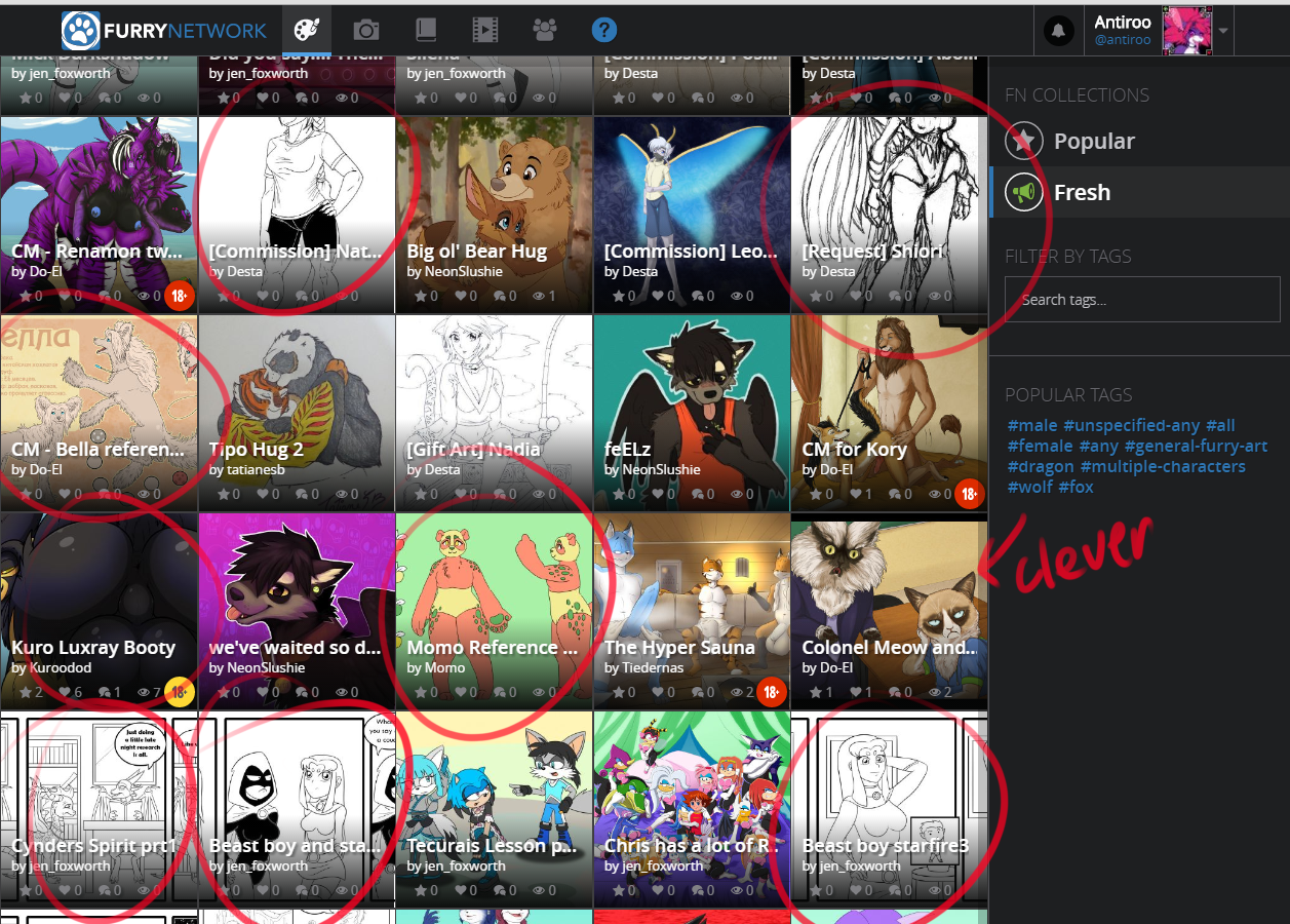
Here's an example of what I mean. You see several of the images have the entire heads cut off of images. Names cut in half, and the comics along the bottom are zoomed into only the middle panel, potentially spoiling a punchline. One clever artist used a thick upper and lower boarder to make their artwork square, to prevent their character's heads from getting bisected.
The point of the feed is to allow people to view artwork, these images are much more likely to be overlooked rather than viewed and can give the impression that the website has worse artwork than it really does.
I think thumbnails that vary by image dimensions look very ugly and unappealing. I rather have the square ones, it makes FN look really neat and enjoyable compared to other sites there are.
One thing a lot of people miss out is the ability to choose where your image crops - so that you can avoid automatic cropping from taking the head of the character, that feature should perhaps be highlighted better.
Perhaps if both thumbnail types were available, everyone would be happy.
Not really, especially if square is the default. It's a subtle but very powerful effect. People who are not used to designing compositions are unlikely to notice the effect it's having on them, and thus unlikely to switch to the non-square format.
In that case that would mean that there's nothing wrong with the square layout if people are happy using it
Again, no, because it as an artist, it negatively affects the way my work is displayed. Even if a layperson is unaware of the differences in composition, the perception of the piece is still altered. It benefits everyone if the thumbnails provide a true sense of what the image is really about, rather than give a false impression that could steer the potential audience away.
What if the layout where the aspect ratio is represented in the thumbnail is default but the square layout is available as an alternative for those who preferred it in that way?
I feel like square thumbnails don't provide a great overview of artwork. Something that took weasyl a while to figure out.
I was curious what FN would look like with a nicely fitted grid like this, so I used a nifty js library to make it happen.
And it seems to scale pretty well across screen resolutions.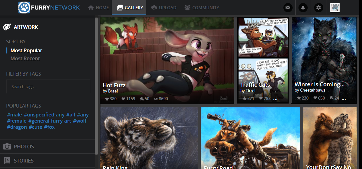
Here's the code, but do note it's only meant for demonstration.
It can be run in the console on the gallery page.I may write a complete version later if I don't run into too many complications (getting image dimensions without causing too much delay is one).