
Profile Page Improvements
Hello everyone,
We're looking at different ways we can improve the profile pages on Furry Network, to try and meet people's needs better.
As we all know, your profile page is your "identity" on any site, and needs to represent you and what is important to you. The current profile page doesn't work well to fulfill that goal - most of the space is spent on "what small action did you perform on the site most recently" - and is too much social network, not enough art/creative site.
I'm working with our interface designer to come up with some mockups of an improved profile page, which has interchangeable modules you can embed on your profile page - and need your input:
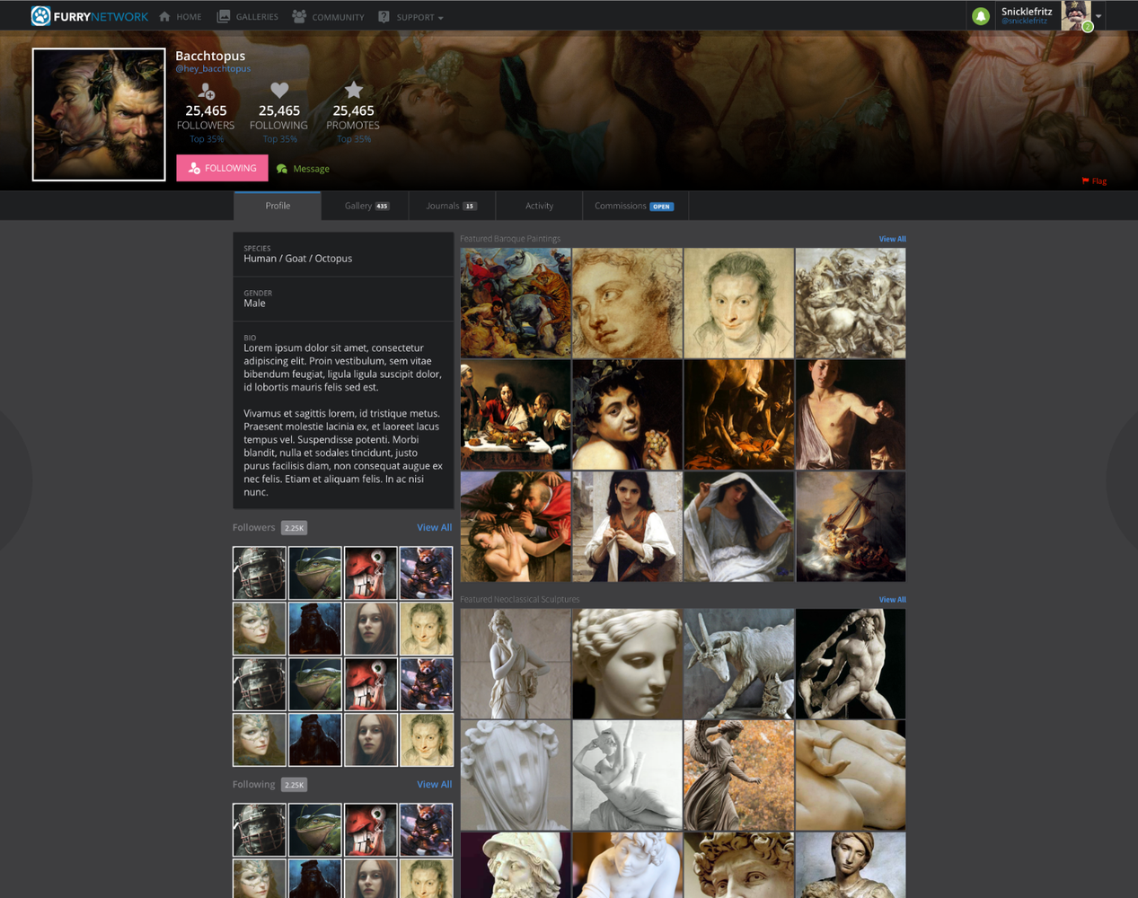
1) First of all - is this on the right track? Is this heading in the right direction?
The modules we're thinking of including are intended as 'feature blocks' you can use to set up your page however you'd like - so say you mainly write stories, you'd put the "featured stories" block near the top - if your page is heavily character/commission oriented you'd put one big image at the top (like a featured submission), and a description box below it with a bunch of Markdown formatted text in it. Note the edit button:

This "edit button" would bring up the following interface for picking what to show:
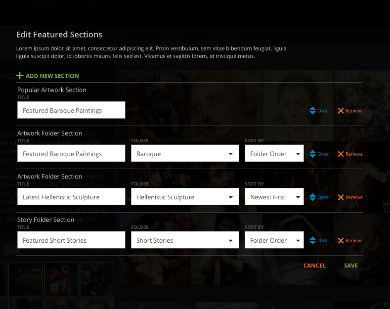
This leads into my next question:
2) Are these "modules" a good solution for the site, in particular to give flexible but not too complicated customization, to let users tailor the page to their needs?
3) What modules would be most important to include initially? Are these on the right track, or should we be considering something different? So far we have:
3A) A "Featured Artwork" module, where you can pick a folder to display, a sort order, and a number of rows/items to display. Eg if 1, it'd show one big image - if set to 1 row, it'd show 4 pictures... and so on.
3B) A "Featured Story" module, similar to A but for written submissions
3C) A "Journals" module, similar to B, but for posts/journals
3D) A "Markdown" module, which would basically be a big text box you put markdown in, and can customize to your heart's content
3E) A "Gallery/Favorites/Recent whatever" module, very similar to A, but which is automatically populated based on something directly on your profile - for example, your promoted artwork (think "Favorites" on other sites, long-term), or your most popular artwork in your gallery, or your most recent submissions or whatever.
3E) Has been split into two: a "Recent Artwork" gallery module, showing stuff you uploaded recently, and a "Favorites" gallery module, showing items you faved/promoted recently. (Assume there'll also be modules down the road for recent multimedia, audio and stories).
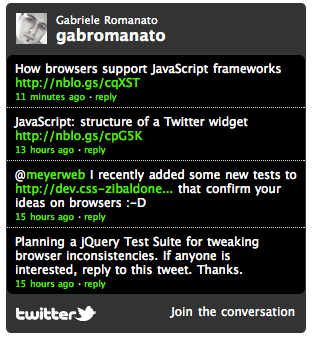
3F) A "Social" module, which can show your recent tweets on your profile page - like this:
4) We're toying with the idea of putting all content a user creates into a single "Gallery" tab, and moving the split between the kinds of content on the left hand side along with the filtering / sorting options. In my opinion, this looks pretty busy - but what do you all think?
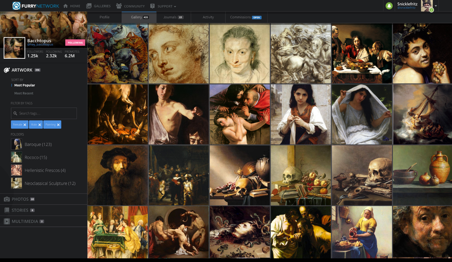
There's a lot here in this one "Suggestion", but I think this is the best way we have (right now) to get a discussion going and some useful feedback on how we can refine this to better suit everyone's needs.
Please post your thoughts and suggestions - and be sure to reference the number of the item you're discussing, so it doesn't get too confusing. As always, be constructive! We want to make FN better and need your help.
Thanks!
Varka
Answers

I doubt Darius Hunter will ever come here because the accounts section says 'Characters'

Overall it's a pretty nice landing page. Might be better if the "Pinned Artwork" is full width similar to profile (since presumably it's the best work someone wants to lead with), with the pinned journal under it. Move the user activity to where the "shouts" are. (FN doesn't have shouts, and it would be awesome if they kept them off, they're just page clutter and relatively useless.)
It would fit better with less empty space.
Another thing to keep in mind is flexibility of the layout. A lot of people browse sites on tablets nowadays, so what works on a widescreen desktop doesn't work as well for a portrait display. Although given the flexibility of FN, they already have different layouts for each, but some consistency between them is useful.

I mean, I suppose shouts are subjective, but I like shouts and they seem very very popular among the user base. In fact the reduce size and prominence of shouts on weasyl and sofurry pages is part of what makes them feel less personal. I guess the big thing though is that a lot of people use them, and in terms of things that the community finds valuable, they're probably more valuable than an activity feed if you were going to keep one or the other, imho.
You could definitely make the pinned art full width in alternate versions of this page though.
My design is for a desktop site. I'm sure there could be other designs for mobile sites, but I don't think the desktop site should be reduced in functionality at all to accommodate them! The furry community is used to the desktop-oriented FA and I don't think a mobile site is gonna be a major selling point so I'm not sure if it should be that big a priority here for now.

I agree, I think shouts are an easy way for artists or watchers to say Hi or give thanks to people following them and etc. rather than sending a message, Shouts are nice and quick.

I do suppose it's subjective. I ignore all shouts pretty much, and feel they're a relic before social sites became popular. I'd rather see what's popular amongst the people I follow, i.e. art, stories, new folks, etc. Helps discover new things. I feel that's sort of discoverability is a strength FN has over other sites currently.

As far as discoverability goes, I would say it's important to have favorites visible and be able to see what people like on their profile pages, but I don't think you need to get rid of shouts to do that. I think if you did a poll of users on all furry sites they would find shouts to be pretty important. It's like being able to tweet at someone, or post on someone's Facebook wall - being able to have a public interaction with someone that's not under some other context, like under a submission or journal. It's a great way to say hi to someone.

This is a gorgeous design. I would love to see this be implemented, though possibly with the ability to shift, and, and delete modules on the page at the page owner's discretion. I think that would be basically all that would be needed to make this fully perfect.

Why is everything on this site so HUUUGGE? The avatars, the thumbnails... it feels like I'm sitting 2 inches away from a 55" TV screen.
I expect the logo icon in the upper left to take me back to the site's landing page, so I can browse recent art but it brings me to my own page. The links just aren't intuitive. Wherever I see my avatar, it should take me to my page where I see my artwork. It's so confusing I don't even know how to describe it.

I agree with the links and avatar links. Its It's pretty standard. Idk why fn deviates from that. Even Facebook will take you to your own page when you click on your avatar.
I hope they implement this suggestion as well.
Side note: I personally like the bigger avatar display image. Allows for more creativity with them when drawing them.

I agree with you... The Furrynetwork layout almost looks like it's leaning toward being more of a mobile site in its current form, which is a bit of a turnoff, for me at least.

I highly approve of this design. Alot better than the current imo and feels more user friendly, while also promoting the artist rather well.

Whole-heartedly agree with you and everyone else here on the need for journals. The page layout you have here looks great so far, and I really like the left sidebar of information as with the userpage header. It's organized, clean, and just very visually appealing. I also agree with one of the other people on here that there should just be a "Social" tag/page with shown journals and "whats on your mind" stuff since the gallery is what most people are here for.
Only thing Id have different is that others could view what you promote instead of what you favorite. I like the fact that favorites are personal on FN because it means I can fave things and not have to think about others questioning wtf I'm faving, lol. I'm promoting someone's work because I want that piece to be seen by others.

I'd honestly say that the biggest reason FA keeps winning the popularity contest is because no one wants to move away because their friends and submissions are already there. FN and other sites are already much more solidly built.
That said, your idea is very sound. I find that I rarely pay attention to the activity feeds. I visit a userpage to learn more about the person and see his work, not to see his breadcrumb trail around the site. New posts, favorites, promotes, and follows can be represented through better means.

I have a personal theory that it would actually not be that hard to start a mass migration from FA if there were a clearly better alternative to FA that did everything FA does just as well and improves on the formula, but so far, I don't see a site that really fits the bill. There was some good discussion about this on this journal. FA's classic interface doesn't look modern, but it's very simple and functional and places emphasis on the right things, and myself and most everyone I've talked to really really prefers FA's interface to anywhere else... So I think that's one reason why more solidly built sites are losing out, not just popularity.
And yes... The more I use FN lately the more I really think userpages are broken as they are currently. 90% of the userpages I click on I am not greeted by any art at all aside from the icon/banner, just a list of who they've followed, even people with full galleries. It's all wrong for a furry site. :(

So you don't like the other available art sites and decided to come here and try to get this site changed?
I agree the layout isn't good for an art site, but it seems like they are going for something different, more social media/art site.
It's amazes me how often I see this. 'I don't like this site and it won't change to suit me. A new site, lets see if they will change to suit me.'
Little improvements are fine, but if you don't like the site for what it is then either make your own art site or just live with it.

I honestly love how this looks and agree with it! As unique as FN's profile interface is, its kind of an eyesore and personally its hard for me to navigate through it without feeling overwhelmed. So it would be nice to have the option to customize it to your liking.

I'd enjoy it if the user page layout had a bigger emphasis on the user's submissions, yeah. I assume it'll slow down once everyone's gotten settled, but it's a bit strange to go to an artist's profile and not really see any art off the bat.

I really like this concept! I'm a big fan of the smaller banner. The current fullscreen banner just feels too big. I'm not a fan of how it only shows a sliver of the picture used and that has a fade to black at the bottom. You can't see the full banner unless you want to scroll up when you land on the users page. A banner that size in this concept is perfect.
I also like the placement of the follow, msg, etc. Favorites should totally be able to be seen! I have found so many artists just by looking through other people's fave's but if people don't want to share that then there could be an option to disable veiwable fave's or disable veiwable adult/mature fave's.
That middle section could be used to show what the user wants. The user could choose what they want to appear first. Like if they want to use it socially they could have their activity, shouts, journals, etc. Or if they want to show off art they can have their gallery appear first. If you wanted to look at one or another you could witch between them?

Yes, please.
I really hate the feed thing. I literally couldn't care less about what artist x did 20 mins ago.
I want to see what sort of images they submit and what stuff they favorite. That's it.
Also I went ahead and upvoted the suggestion to add shouts, because I think an user page needs to have shouts for all the things that are not worth actually writing a private note about. Like "omg cool art" or "what's up? :3 " etc.

- I like the smaller, (preferably static) banner.
- I like the left-aligned scheme for profile details. (But would like uploaded content details to be underneath the upload rather than to the right.)
- The gallery and favorites section is close to what I would like, but with maybe a folder/collections tab or bar.
- The upper block for the main body, with the 'pinned post' and 'pinned art' art perfect, and with this, I feel the feed can still be useful IF users are enabled to pick and choose what they would like to show in their feeds.
- This overall is very, VERY near to what I would like to see for an artist's profile.
I feel the comment that this needs to be focused away from being a social website to being an art website is missing a larger point. For a content site to thrive, it needs to feel strong in it's sense of community. (Which, is really how the fandom as a whole as grown and thrived.) The social aspect needs to be there, so I would not discount those that would really enjoy having a more personable space, to talk with friends, as well as the creators they are fans of.
I will end up most likely hunting for this suggestion or making it if it isn't already in the pile, but I would like to see this mock-up taken, expanded from, and given different profile templates for each type of user. (i.e.: Artist / Craftmaker, Musician, Fursuit Creator, Fursuit Performer, Social, Character / [Art Collection])
So far my biggest complaint with the site currently still is that it is not intuitive, and not in a 'easily read' manner, due to certain fields like submission details being in areas I'm not used to looking to in an art submission. I feel the intuitiveness/user-friendliness could be helped greatly by the implementation of a number of details here, and possibly expanding on the idea by adding user profile templates/field suggestions to help get new users started.

As someone who is kind of 'ehhh' of the site right now because it looks more like a social media site instead of an art/story sharing site, this would be nice.

Yeah, a lot of the info in the feed is redundant and takes up.so much screen space. It would be better if there was more gallery/promo display/access

I may come back and write something more detailed but for the time being my only thing would need its own tab. Not a module but a tab. Like every other art site across the board. people like viewing favorites. I mean the option to disable it can always be a thing( i personally disable my faves when capable so i'd like that feature) but i remember reading in another thread how important it is for favorites to be 'static'/standard.
otherwise this is on the right track imo. As long as my art is the main focus when people view my profile i'm more inclined to share my FN page.
I'm not sure this is the place to discuss/mention this. but also someone else mentioned that if we did want a sort of 'social' tab or section. doing the 'twitter' tab. like on tumblr , deviantart, or facebook would be neat. Since there are so many artist branching out to twitter too and it'd be a way to streamline it.
Personally though i wouldn't care whether this feature was or wasn't added. I think it'd be neat. yes. But I could do without it.
can't thnk of anything else atm so like i said i may comment more, later or when there's more/other comments to read too.

So if I understand you correctly, you're suggesting that "Favorites should have their own tab"? I think that sounds reasonable and doable - so you can also browse that user's favorites on a dedicated page, not just via a little gallery module.
When it comes to the 'social' tab, we could probably rustle up a Twitter 'module' that plops on your profile and shows recent tweets, a-la Widgets on Twitter's site. I don't think that'd be too much of a problem (probably worth its own thread once we get things figured out in the big picture of profiles).
Thanks for your input!

THIS! One of the biggest frustrations so far is not having fluid movement to other artists' content from one gallery to the other. I would find it so much easier to connect to people via a publicly displayed favourites system. I think it's important to see what friends and artist's favourite should they be willing to enable it to be visible. The suggestions for page layouts seem rational and would contribute, but not having the means to view favourites and thus immediately other artists atm (whether or not its in the pipeline) is a setback imho.
Currently, it seems like the quality of a person's avatar is what entices you to visit their page as opposed to favourited works.
Also, big yes on Twitter. The majority of the communication I do with friends and new social connections is on twitter currently, and being able to have that integrated with FN would be magical. Anything that decreases obstacles between social interaction, sharing art and finding new people and their work is crucial!

Letting the user features what they want in order on their profile is great! Making this an art site instead of a social media site is the right way to go, most definitely. You can also have a social feed in some far off tab for people to select if they're one of the few people that prefer that.
The number one priority for modules is to make an artwork module. Why? Because is this not mainly an art site? As for the others, definitely necessary for the future, but art should always take priority over anything else on this site.
Oh and I seem to notice in the gallery tab you can't hide/show artwork, multimedia, stories, and photos separately. That feature NEEDS to stay, as a lot of users have a huge mix of things. Sometimes you just want to see art, but that person has a lot of fursuit photos. Other times you might just want to read stories. Maybe some people have PCs that can't run multimedia, so they'd rather hide those completely.
In short, yes FN is heading in the right direction!

I believe the way that gallery tab is supposed to work, is to have you switch between content types on the left - which means you'd only be able to see one at a time.

Well it's not bad, though I still think it would be better to give the user the option to see a mix of what they want. Less mindless clicking around. I wouldn't know if that's possible with the system that you're thinking of implementing, and this isn't something worth throwing the whole system out for, though if it's possible to give the option that would be nice.

The modules are a really good idea! The way they're displayed I don't have much to say on, but why is there so much space on either side of the page?
Could you use that space to fit in the [custom fields, followers, followed by] on the right,
[Modules] in the center,
and [what's on you mind? / activity] on the right? (They would all have their own columns)

I think this might be a bit too cluttered, it would need more breathing room, I think

Well, remember that different devices have different screen widths - so the items would stack to become 'single file' when the window isn't wide enough. It just happened to be that I took the screenshot / the mockup was generated on a very, very wide monitor.

I thought that, too. As someone with a big screen myself I'm a bit disappointed on how much space is wasted on PC because people should also be able to view it on the smartphone. (Personally I avoid looking at large pictures outside because my internet is slowed down after a certain amount of data.) Therefore I appreciate that idea.
However, I'm not a Web designer, so I don't know how difficult it might be to squeeze everything planned a bit in a responsive design.

well no.
there are people who don't have the money for a large monitor. or people "like artist's you know, what the site is made for posting" Who will have the window on one half the screen while they work on their pictures on the other half
It's not just for cellphones. but for any screen with.
so. it's cool you have a large screen. but those of use who don't would get an ugly mess.

Do you anticipate any potential for individual customisation of page layout, (deviantart example), or are you going for a unified approach over all?

1. I think the direction is good! I'm glad there are edit buttons on page, too, and that activity is its own tab. However, I feel like "Recent Submissions" should be something that is automatically at the top of a page, so there's something that changes every time a user posts, and you're not only seeing their hand-picked works when you visit their profile.
I definitely find this better than infinite scrolling, though, as that takes time to load, and once you lose your place by refresh, good luck getting back to it in a timely manner! >3<
3. I think a "favorite artists" or "friends" mod would be nice. I know several commissioners on FA may not post art, but they like to feature their favorite people. The ones you have now are also nice ideas. I especially know people have been wanting some journals!
4. I do like the options on the left hand side. I think I've been trained to like it over various art sites, and it's not something you need to break away from to be unique.
Nice work so far! Looks good to me. :)

1. So to make sure I understand you correctly, you're suggesting that we force the first item on the page to be "Recently Uploaded"?
3. For favorite artists/friends, I think we could either do this as a "show a list of users" module (who you cherry pick who shows up), or add the ability to embed icon links to people to Markdown. That way you could just have a Markdown box with whatever formatting and listing you want, with those icons as you want them to be.
Thanks for the feedback!

I'd also like the option to show off things I've favorited or promoted, as some non artists might also like to show off commissioned artwork this way in place of a gallery of their own.

This is one of the modules we're proposing - I clarified 3E to mention this would let you show off stuff you've faved/promoted.

1) First of all - is this on the right track? Is this heading in the right direction?
>>I like that you can pick what to feature on your front page, but i don't like the squareness of all of the previews, i personally don't like having my art show only one small block of the piece i like the whole thing showing, and there's a lot of people who feel the same
2) Are these "modules" a good solution for the site, in particular to give flexible but not too complicated customization, to let users tailor the page to their needs?
I think they're pretty good overall
3) What modules would be most important to include initially? Are these on the right track, or should we be considering something different? So far we have:
3A) A "Featured Artwork" module, where you can pick a folder to display, a sort order, and a number of rows/items to display. Eg if 1, it'd show one big image - if set to 1 row, it'd show 4 pictures... and so on.
3B) A "Featured Story" module, similar to A but for written submissions
3C) A "Journals" module, similar to B, but for posts/journals
3D) A "Markdown" module, which would basically be a big text box you put markdown in, and can customize to your heart's content
3E) A "Gallery" module, very similar to A, but which is automatically populated based on something directly on your profile - for example, your promoted artwork (think "Favorites" on other sites, long-term), or your most popular artwork in your gallery, or your most recent submissions or whatever.
>>3E sounds too jumbled and confusing, need more info but it sounds like it would show way too many different things in it to make any sense looking at. i like the idea of being able to show off your favorites but if it also shows your own art and stuff that makes it confusing
4) We're toying with the idea of putting all content a user creates into a single "Gallery" tab, and moving the split between the kinds of content on the left hand side along with the filtering / sorting options. In my opinion, this looks pretty busy - but what do you all think?
>>is this all contend including artwork, writing etc.? then yes that would be confusing, if it was all artwork created, i think it's already set up that way with folders showing on the side, i don't think that's a big deal but i like how they set it up on DA where they have it so you can choose if a specific piece shows up only in a folder or in the general folder
>>as for any other input, i wanted to add that you guys don't currently show people's (promotes, or public favorites) as files but currently show them as links/status notifications, why is it set up that way? most people don't click on those, i like the idea of having a section that shows off your public favorites that shows the artwork already there so people can already see what it looks like, currently it's set up kind of in a confusing manner...

1. Is this "don't make thumbnails square" more feedback directed towards the entire site and way galleries are done overall, or is it just specific to the user profile page? I'd assume if you picked one "featured submission" it'd display in whatever shape the image dictates.
3E. This module is meant to be able to be for one of the list of items I mentioned - eg, you could have a "Favorites" module, or a "Most Recent Artwork" module, etc - but they wouldn't all be mashed into one box and shown together. You could add one for your faves, and a separate one for recent submissions though.
4. It's all kinds of content, with different 'sections' you can click on, on the left, to switch between each kind. Eg it'd show gallery first, but you could click on Stories and it'd switch t show those.
Other input: That's kind of what we had in mind with 3e. Do away with the activity feed view as the only way to view someone's favorites, and make it so you can click on a tab "Users' favorited art", etc. Would this make more sense?

A customizable profile page would be a significant jump over the other sites. Many IoT sites are opting for "dashlets" that the users can lay out themselves to see exactly what they want to see. These would be a little bit more advanced than a dashlet, possibly.
Between the two layouts presented, I like the top one better than the bottom. The bottom is way too busy and it's easy to get lost trying to figure out what you're looking for.
As for the most important dashlets, IMO:
- Submissions, in an appropriate container based on content. (This could be tricky with mixed galleries, but maybe provide style options? Artwork is fairly standard. But a music folder could appear as a playlist. Stories might have a cover look, or provide a quick render of the first bit of text in them (Or customizable tagline/jacket text)
- Promoted submissions. There are a lot of people who surf others' favourites, and this is a big way for artists to get discovered. (Also, I'd suggest disabling promoting one's own submissions overall, but definitely in this list.)
- Journals. A lot of people use them, and when they come live, I expect it will be something they'll want to easily display to new users.
- Commission status widget. Small little thing that basically says Open/closed and allows for a couple of links for TOS / Prices. Default icons or allow artists to show off their work with custom status images?
- Followers / following: Allow customization of number of rows. I don't need to see 4x4 on these. 1x4 or 2x4 would be the most I'd want to use.
What I don't want to see:
- every small little detail about what the user has been doing. I don't need to know every time the user has commented on a submission.

Thanks for the feedback on all of these! Your input broadly mirrors what we had in mind for this (especially promoted submissions / journals).
Good feedback on the followers/following row count!

Hey all! We've taken your suggestions on board, and come up with some mockups of what the Furry Network profile pages might look like:
https://support.furrynetwork.com/topics/1116-profile-page-improvements/
I'm going to leave this topic open for a while still (until the new one gathers some steam) - but will probably merge this one in as a 'duplicate' of the one linked above. That way the votes still count and the discussion is still visible - but hopefully it won't be so crowded in the discussion section!
Please be sure to post your feedback on what we've come up with there! Thanks <3

One thing that keep annoying me is the fact that when we're looking at someone's profile and we scroll up, the header picture just keep getting bigger and bigger.
My suggestion is to fix it's size, not leaving it too big.

We originally implemented it that way so you can add a great image to the top, and have only a little bit of it show when someone first visits the page - but to let them scroll up and see the whole thing if they want to.

Personally I'd rather use something with a fixed size. When I set up the page a few months ago I really struggled with how I have to save the picture, so that when the user scrolls down he still sees a nice picture and not just a very unimportant or confusing part of it. In example a single foot on a large simply coloured background instead of the angry face. If it stays that way I'd like to have an option to say which part of the header remains when the visitor starts scrolling.

First of, I love this, it reminds me of what Deviantart Premium Tried to be.
I like the top a lot. From what I understand it enables us to use our collections to a use that is immediately apparent right off the bat. Let us have the option for the first thing people to see to either be our "newest" or "portfolio" collection and then allow additional folders below. I suggested that promotions and bookmarks be another separate tab so that they can easily be viewed without distracting from your work.
One thing however, I think the thumbnails could use a little bit more padding between them and also be file specific. So if a user liked the square look, they could use their own judgement with uploading a square thumbnail. However, it's not a great way to feature certain kinds of illustration that gets cropped or squished
Activity needs to have a bigger purpose to have a tab at all. I still like the idea, but it could use some improvements, for example, instead of saying [User Y] commented on [User X]
it could have
[User Y] commented on [User X] (User X Thumbnail)
"User Y comment"
and of course have activity be a toggle option to prevent stalking,

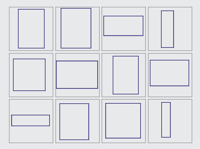
How would we handle oddly-shaped submissions in that layout though? We support 'custom thumbnails' right now, so you can crop your artwork to whatever part you'd like and that's how it'd show up. Are you suggesting we show the image in its original proportions? How could we adapt the layout to support that - particularly for very tall or wide images?
Good input on the activity tab. We're going to make it enableable/disableable for sure, and I think we could revise the way notifications show up in it to be more useful.

I think supporting basic aspect ratios would be more than enough. As for users who make tall tutorial like images or wide banner like images, they know the risk of making such a picture, so it should be their responsibility to set a thumbnail if need be. What I imagine is possibly having each possible section being a square, with the image thumb fitting inside to still keep a neat layout,

ehh from a web designer's point of wiew, thumbnails that look like that are very ugly and unappealing

1 & 2) I personally think this is a great idea, yes. Different users have different needs. We are artists, writers, musicians, crafters, fursuit performers and so much more. Some of us just prefer to look at art. Allowing us to customize our userpage is going to reflect who we are, what our focus is on is probably the best solution to the profile page issue. Sounds like a great plan to me. I think modules are the best way to go about this.
As for a suggestion for a module: perhaps something that ties in with the commission system in some way? Could also be useful if that could be tied with the whole journals/updates you mentioned and that way send notifications to user's inbox that an artist is open for commissions. I check this site more often than my email, and with some artists, it's a matter minutes if you make the cut or not.
Another suggestion of mine would be indeed to implement the promote as a module, as others have said. This is for myself and many others a way to discover other art/artists I like.

This is definitely on the right track, though I feel that it might be nicer if the submission thumbnails are proportionate to their actual size rather than one square for everything. Weasyl had this problem and it was one of the more prominent complaints from regular users of that site, but that's been changed since then. Obviously having the square thumbnails makes the gallery in general "neat", but at the same time it kinda devoids it of any personality.

Is this more a general criticism of the site's way of displaying images, or just the user profile page?
We have a voting thread for doing it site-wide here: https://support.furrynetwork.com/topics/1074-set-thumbnails-native-aspect-ratio-rather-than-squares/

A customizable page would be A+ and I really like that gallery tab.
I like the activity tab as well. Are users able to disable that though?? Cause i know some people dont like their activity to be displayed publicly!
A favorites and/or promotes tab/module might be good. I am a constant fave browser to look for new artists. I regularly browse the favorites of artists I admire! And of course an option to make these private as well. I know a lot of people that like to keep their faves private like they do their activity.
Either way I like that the users artwork is featured here before activity. That was my biggest gripe. I like this so far and im willing to give it a shot. Its definitely better than the current userpage.

Yeah, activity tab would be disableable: https://support.furrynetwork.com/topics/461-get-rid-of-the-system-that-allows-every-user-to-see-all-of-your-activity/
Thanks for your feedback!

1/2) Significant improvement
3) You seem to have the most important ones for initial launch. Later down the road, I'd like to see a stream iframe / streaming status module (especially if it connects to picarto automatically so I don't have to manually update it when I go online/offline)
4) Yes please

Thanks for your feedback!
For 3, I recommend voting / contributing here: https://support.furrynetwork.com/topics/167-streaming-notification/

I think this is all good, but also like the idea of having modules for IM addresses where when someone clicks the icon, it opens the program to that address, much like FA. This also would be nice in linking to pages on other furry sites

Note that this function would depend on the individual chat/social apps providing linkable profiles. Definitely possible, but nit guaranteed for all

This is also currently possible if you know the link codes. For example, Telegram links are http://telegram.me/USERNAME and Skype should be skype:USERNAME?chat (but they may have dropped support for that). You'd just have to put a link somewhere in your profile such as a custom field.

personally i like all this, but it would be nice to have a social networking aspect back. would kinda like to get away from Facebook eventually!

Really cool! I think being able to customize the page is the best way to go. And if you can drag and drop and arrange the position of modules on your profile page in a sort of page designer with your mouse I'd certainly wet myself...
I think it's great to have modules and it could also be good if users can decide how big they are, like how many rows show up in their favorites gallery or promotes gallery or whatever it's going to be, and their art gallery, and such.
Ultimately giving users the ability to create whatever page they want solves every quibble about how pages should be laid out doesn't it?
I don't know if the area on the right, with profile into, is going to be customizable, but it might be nice if you could add things there as well. The "who you're watching" icons are still kind of big and attention grabbing given their semi-minor importance and you could put something else there like page shouts or a recent site activity feed or something else in between profile info and those icons - maybe let the user choose what they want to put there

"3A) A "Featured Artwork" module, where you can pick a folder to display, a sort order, and a number of rows/items to display. Eg if 1, it'd show one big image - if set to 1 row, it'd show 4 pictures... and so on.
"
I feel the absolute first thing to get in would simply be a module that displays the most recently posted artwork, So people can see how active you are. On fa, the gallery previews show the upload dates, and from that you can get a quick impression of how frequently a user posts, and thus how often you might see their art if you watched them.
This simple thing allows users to make decisions about your account, see your freshest work, and provides an easy way to dive into your material.
So, while all these things are great ( really like just about everything you suggested in this post!), The default module should be 'recent submissions', and then letting us make a little 'best of' module where we arrange our best work, to make the best first impression on whoever showed up on our pages.
The idea of customizable like, gallery widgets? Is a really hot feature idea, and i would be all over it.

I love the idea of modules, it gives users a ton of control over how they present themselves. The six modules you've listed in 3) feel like the most essential, besides streaming notifications as Fek mentioned. Overall this all feels like a good number of steps in the right direction.
4) might feel a bit busy, that's a fair call. But I think what's equally important here is that FN is making the most out of the space that's available. So really, if a user wants to view an entire gallery, let them have the entire gallery! However I would suggest making folders more prominent? Maybe this could be achieved by having folders act as tabs across the top of the gallery, or something to that effect.

Before I get into my comments, I first wanted to thank Varka and the rest of the FN team for being so attentive to the input of your user-base. Your hard work and passion really shows and I can’t tell you how much it is appreciated! Thank you for being so open, both in your listening and the of showcasing your progress. It personally gives me a lot of hope for this site. I really hope to see this fire kept alive, keep going y’all!
Now to my comments to your direct questions.
1) First of all - is this on the right track? Is this heading in the right direction?
Yes! I can see that some of the suggestions from the mock-ups on this thread [https://support.furrynetwork.com/topics/459-userpage-layout-changes/] have been used. I would like more of them included. Specifically, how it seems some modules could be grouped or snapped together. I like the prior thread’s suggestion of moving the feed into it's own module, and I like your mock-up with it also shown on it’s own tab. Both module and tab versions of the activity feed would be nice to have.
I think the followers/following sections are too large. I think 2 rows of 4, with the 8th block being a link to the full list would be a better choice for both sections. As well as the ability to hide those or any sections a user chooses.
Overall, I really enjoy this! It does remind me of the 'widgets' that DeviantArt Premium features, like someone else mentioned, but this is good! I really love the widgets on DA and the ability to re-order and customize my profile. I would greatly appreciate that here.
2) Are these "modules" a good solution for the site, in particular to give flexible but not too complicated customization, to let users tailor the page to their needs?
YES! I mentioned the idea of 'profile templates' in the previous thread, and I think this would really fit the bill, as it will allow people to craft their own profile to suit their needs.
I still think field suggestions or pre-built profile templates for specific member types would be appreciated. Giving people a boost with getting started on the site with suggestions for what modules to use based on their preferred participation type, be it an artist, a musician, a writer, a fursuit performer, or a social page for fans to talk to others, I think it would be a big help. Sometimes a blank page can be the most intimidating thing, and a prompt or suggestion can make all the difference, I personally feel.
In terms of how to incorporate this concept to the Markdown Modules, here are my thoughts. When choosing a profile template, say in this case for a social profile or original character, I imagine the next page as a 'preview.' This preview page gives the user the ability to drag+drop and edit their profile's modules. I would like to see it with some pre-arranged markdown modules that suggest fields, like links to your other sites, or things as simple as age and such.
DA's premium-only accessible 'widget' feature is similar to this, and I really enjoy it.
3) What modules would be most important to include initially? Are these on the right track, or should we be considering something different?
Whoo boy! Lot to consider here. I want to go back and point out the mock-up's in the prior thread. I am not entirely sure how difficult it would be to execute coupled modules, or how it would translate to mobile viewing, but I am very keen on the grouped section in the mock-up created by Aaros.
In the grouped module at the top of Aaro's Mock-up, it features a singular chosen content piece, a singular featured journal, and a scrollable activity feed, all within a snapped/grouped module, that I would call a 'header module'.
Under the 'header module' was the 'gallery' then 'favorites'. I would like a 'recent art' or 'gallery' module under my 'header module'. I like Vexstacy's suggestion of putting personal Favorites under their own tab, that can be made publically available at the user's discretion.
My initial idea on how to possibly deal with grouped modules translating to mobile would be to have user's prioritize their modules via number, then just have each module appear separate and ordered by priority on mobile. I'm not sure if this is a great idea, I'm not a developer.
So, to try and condense my personal priority for modules:
- A 'header module' that could be capable of grouping/snapping certain featured modules. For me, this would be a grouping of 3A-Featured Artwork/Content (a singular piece), 3C-Featured Journal, and 3F-Social Feed or the Activity Feed (which I think the Activity Feed should be listed as 3G and considered it's own module.)
- Next, 3E-Recent Artwork/Full Gallery Folder, followed by modules for specific folders. (handy for links to folders with full comics)
- Markdown modules would be very important, and I would like the ability to have them also in the ‘body’ and not just on the ‘sidebar’
- I think the option for personal favorites to be public or private should be decided on by the user, and would possibly be best moved to their own tab/page. I think the option to still feature a favorite or a specific collection/folder of favorites as a module on a profile would be appreciated by some.
- Like Favorites, I think journals should be given their own tab, if not planned already. I see it in the last mock-up on this thread, so I'm assuming it is.
- I would greatly enjoy if a user's characters could be given a tab of their own too. (Thought of as a secondary gallery of sorts, perhaps. A place to feature art acquired from others of specific characters, separated by folders.)
- Would it be possible to have a menu bar on the full gallery module? I imagine a drop-down menu linking to specific folders in a user's gallery.
(While also slightly unrelated, I thought I would link my support topic for multi-tiered folders, as it would be an area possibly worked on parallel to the profile updates. [https://support.furrynetwork.com/topics/1053-enabling-of-multi-tiered-folders-within-personal-galleries/])
4) We're toying with the idea of putting all content a user creates into a single "Gallery" tab, and moving the split between the kinds of content on the left hand side along with the filtering / sorting options. In my opinion, this looks pretty busy - but what do you all think?
While I personally don't find the left sidebar busy, I can see how it might be to others.
(This is slightly unrelated, but how difficult would it be to give users the choice on what side of the screen they want their 'bars' to be aligned? I'm not keen on the left bar, and would prefer the choice to align it to the right. Maybe a field that hugs the bottom would be preferable to others.)
Would it be possible to make a bar under the Gallery, Journal, etc. tabs? On this bar, you could put a drop down menu with the same sort and search features? In the interest of a 'simple' and 'advanced' search, I think the option to pop the bar out into the side menu when advanced features are needed would be acceptable.
As others have pointed out in other threads and here, the square thumbnails and custom-cropping step was not enjoyed when Weasyl had it, and it has since been fixed.
While the custom aspect ratio thumbnail within a set sized box is a great suggestion, I can also see how it would not be as 'clean' as set squares. I would really enjoy not having all square thumbnails, but I don’t have suggestions on how to make it look good.
I think one detail that may help reducing the busy look would be to give more space around each thumbnail. It is very tight currently. Negative space and breathing room is okay to have, but so far, I'm seeing an aversion to it in the mock-ups that FN has produced. There is a lot of info all fighting for screen space, it’s going to be really difficult to refine it.
Thank you for giving your user base the chance to chime in. It feels good to know you are listening and want to give the community a site it can really enjoy using and showcasing themselves on.

((Being able to edit or preview comments within the support forums would also be appreciated!))
Working links: Previous Profile thread w/ mock-ups, by Aaros

I need some time to mull over this, but I can say that at a minimum, this is in the right direction, and on first impression, it looks pretty darn good!
I do worry that the lack of consistency between different user pages might be a little jarring, but I also like the idea of being able to pick and choose what sections matter to you.

Just wanted to chime in a small bit with one thing to say, as I haven't read every bit here yet. I wish to be able to keep having artwork in folders, rather than one gallery shows all. I'm not sure what you meant in #4, but I like the folder option because it allows me to give a link to a specific folder to someone, rather than having to generate some long complex filter of some kind. For example, if I want to put all the pictures of Tasha into a folder named Tasha, I can link that, instead of having to create a filter that gets those images.
Though, I'm not quite sure how to link a folder at this current time, I'd still like it to be an option. Folders feels like a nice way to let us pick how we want to show our galleries. Letting us use your modules as shown in #1 to select which folder we want visible on our page.

Certainly good done on making content sections of the userpage modular, that was one of the good things DA had going for me and pretty much missed from pretty much all "furry" Art gallery hosts.
Thru concerning folders would they be true folders, would we be able to prevent submissions that are sorted in Folders from showing up in general if we so choose? That was a problem with FAs interpretation that where more filters then actual folders.
I also think a separate auction tab(to prevent clutter in the gallery from ychs and so they standout better) and a stream tab could be added.
The only other thing id state is that in the mockup shown so far i feel the content elements do need to have alot more space between each other.
Everything else is pretty much on the right track^^

I very, very much dislike how art and stories are treated as separate things that need to be kept separated from each other. This dissatisfaction carries down to the individual submission level, but the present topic pertains to the profile as a whole.
Art / Stories / Photos / Multimedia: Do not auto segregate these, but do provide filters. (Though note that a submission can be both art AND a story.) If I want to create a folder to store all of a particular thing in, I will do that. But I want to have both art and stories of a particular character or theme in the same folder.
All of these proposed layouts give no indication of what a story submission would look like. Either way, the way stories or Art/Story hybrids are shown in feeds is unsatisfactory to me. If a submission is created using the Story submission type, no visual is shown in the preview and people will both be unable to search for the contained art. If submitted as an Artwork submission type, people will think the thumbnail preview is basically all there is to the submission and the submission won't show up in story searches.
On SoFurry, I've tried uploading a submission as both, but that's both cluttersome and far too much hassle and the same search problems happen there. It would help if custom thumbnails could be done for all submissions, regardless of type, and it would be helpful if one could control how the thumbnail is displayed (as in what type of information is shown when the mouse hovers over).

I think the FOLLOWERS/FOLLOWING section could be cut down to where only the last 8 users appear with a "+" to indicate a view all. The space that gets saved could be used for shouts, should they get approved.

This new layout is freaking awesome!!! And there is that tab what i missed so badly!!!
And userpage is focusing for personal contents!!! <3

Looks like the right direction to me! My biggest complaint for the current update is the clusterfuck it feels like to check anything. It's difficult to check just the new art, or just the new notes. Separate pages for this would be nice. Overall it looks like you guys are on the ball for that though

This is definately looking good! I enjoy the modular idea, aslong as its kept simple like it seems to be in the suggestion. I agree with what Twigs said tho, show less icons for followers/following since too many makes it look very cluttered.

Can't say I have much to add other than I'd be interested in at the very least having an option for the image tiles to be square or rectangular based on the aspect ratio of the image. It's too repetitive in my opinion. Weasyl implemented this quite nicely but the tiles seem to be a little too large.
But yeah I feel that breaking up the monotony would improve no the layout and make it more visually interesting to visitors.

On the Profile page:
A slideshow of some sort would be nice that gets it's images from a given folder or tag to give a submission the best possible exposition whether it is an artwork, a photo or a story.
Also, i liked the Idea from ITunes and such to have a digital-physical representation of something.
I guess this would enrich how stories are currently exposed so a book / magazine like appearance might be interesting to consider and create a more haptic feeling.

This feature has been completed! :D
https://blog.furrynetwork.com/2016/07/26/july-site-update/
Check it out - you can now publish 'blocks' on your profile that do different things:
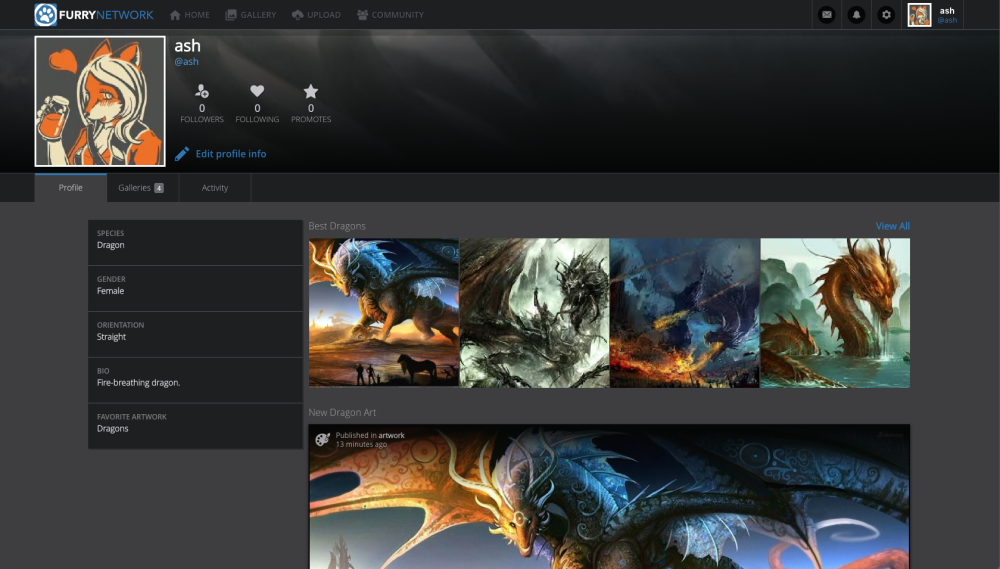
Let us know what you think - and thanks to everyone who helped make this happen!
Customer support service by UserEcho

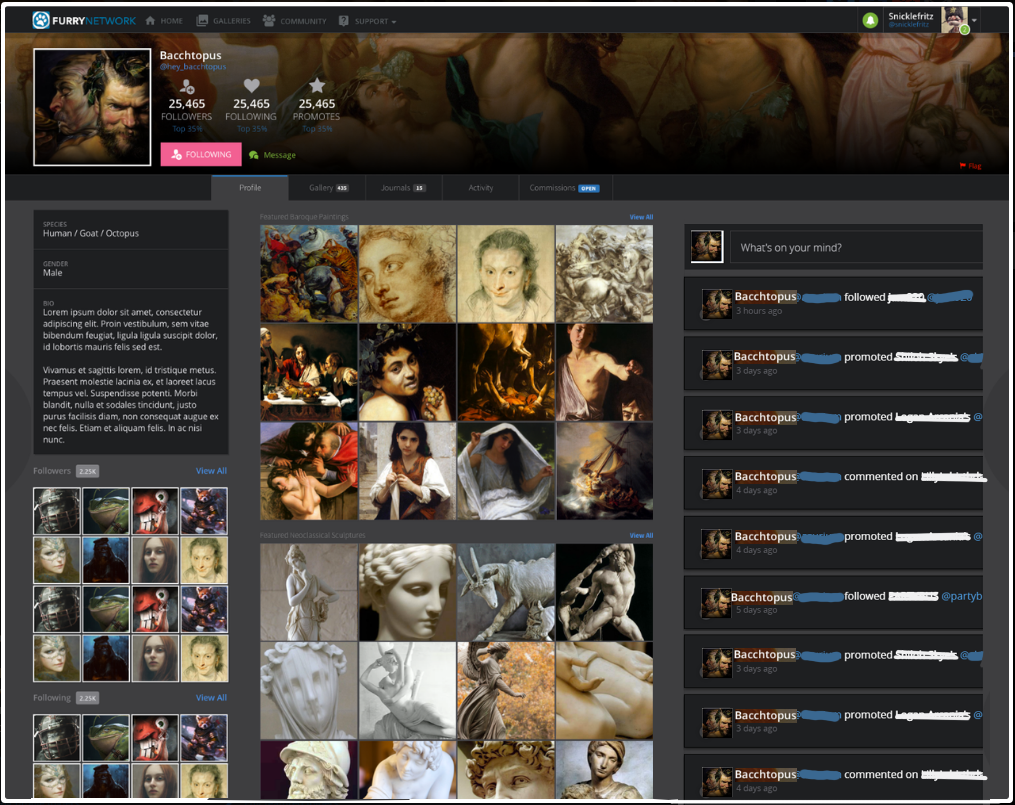


Hey all! We've taken your suggestions on board, and come up with some mockups of what the Furry Network profile pages might look like:
https://support.furrynetwork.com/topics/1116-profile-page-improvements/
I'm going to leave this topic open for a while still (until the new one gathers some steam) - but will probably merge this one in as a 'duplicate' of the one linked above. That way the votes still count and the discussion is still visible - but hopefully it won't be so crowded in the discussion section!
Please be sure to post your feedback on what we've come up with there! Thanks <3
This feature has been completed! :D
https://blog.furrynetwork.com/2016/07/26/july-site-update/
Check it out - you can now publish 'blocks' on your profile that do different things:
Let us know what you think - and thanks to everyone who helped make this happen!