
Grid View & other "What's New" page improvements
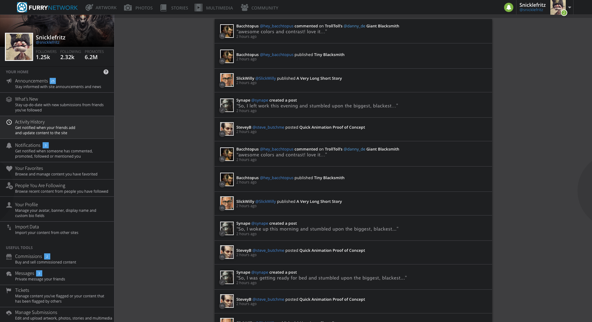
Facebookey feed ---> Something better
The reason quite a few people apparently didn't bother with the site when I asked what they thought, despite the other really well done features AND the fact that you can come here and complain (I guess furry community has given up hope for being able to voice opinion and be heard).
The feed is the main page people visit, it gives first impressions - it needs to be a lot better. Style more like the rest of the site.
Key points that need to be improved:
- Show more items on one view / less scrolling / grid view
- Ease telling apart category types (the post/notifications themselves)
I put together a suggestion quickly:
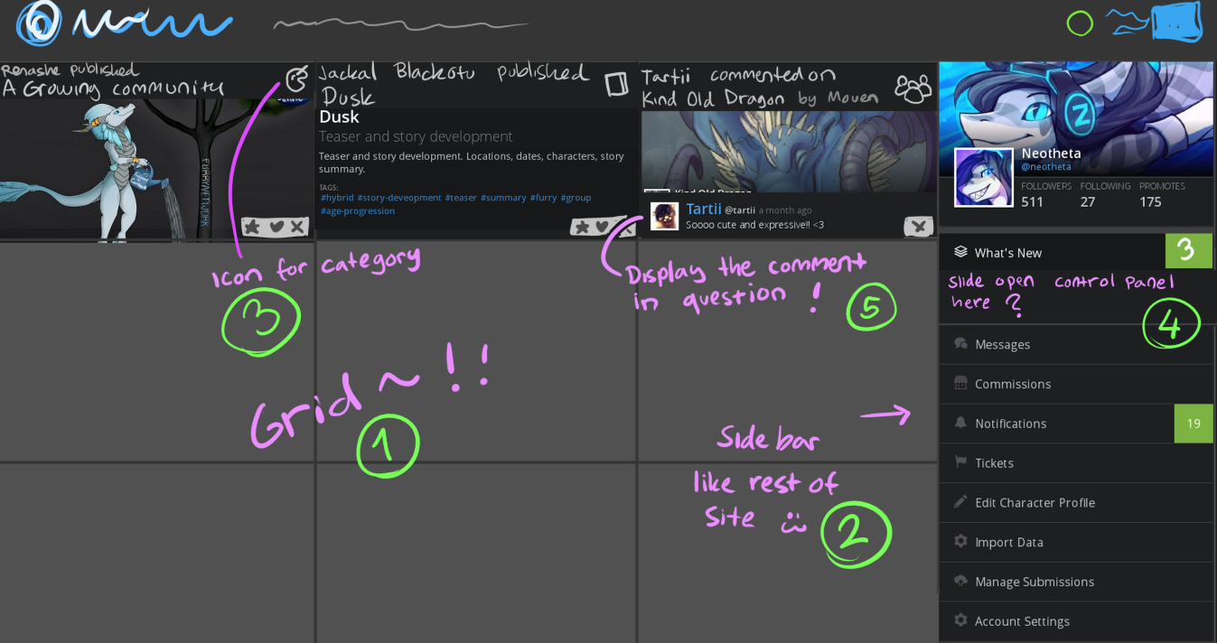
- Grid view
- Personal panel/sidebar on side, style like the sidebars on all other pages.
- Icon that eases up telling what category the post is (same as the top icons?)
- What's new control panel could slide open when chosen
- Lesser thing to point out: When someone posts a comment it only displays latest comments in thread, display the comment the post notified about instead.
- Banner images could display on 'x followed a' and post posts at least, but not everysingle one - it gets confusing.
Discuss! c:
Answer

I like it! I'd also add that this should be combined with your other suggestion of Notification Categories, for ease!

A different suggestion. Feed page but alike patreon's where two rows of new items are listed, items would have varying leght, giving possibility to feature all art pieces at their natural aspect ratio but only resized smaller, or display longer comment threads.
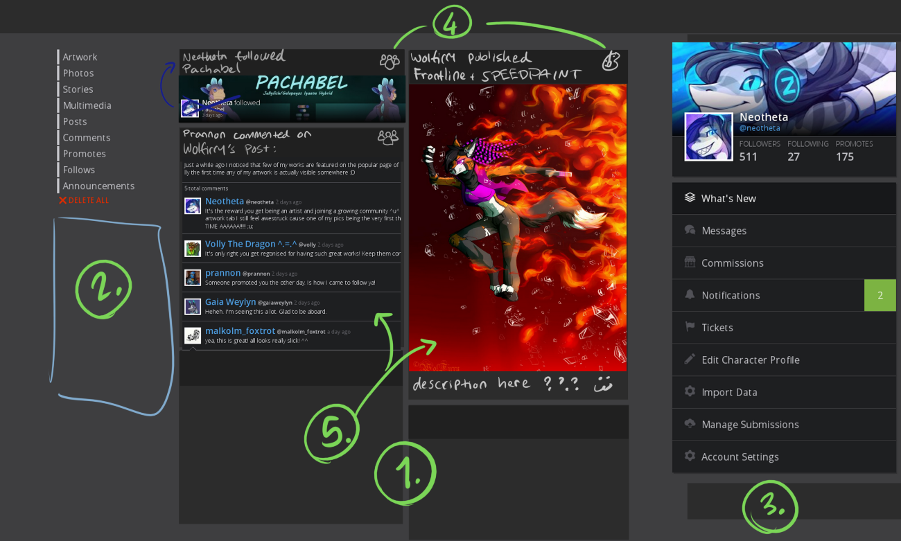
- Two blocks of post-notifications
- Give links to grid view latest artwork/other categories from people you follow here? (pages that already exist)
- This also like a sidebanner? To go with the rest of the site's theme. Could also work alike the current layout tho.
- Small icons to describe notification type, same as the icons on top.
- Lenght of posts depends on content!
Additionally, the most coolest thing would be to have several different types of what's new pages to suit the needs of oldschool and trendheaded people! Which you could maybe switch around in settings?

I'm not sure I could choose between them. Personally I prefer the grid view, yet I can see the merit of both the current feed view and the Patreon-esque one. If these changes are implemented, it should certainly be a choice. Not a total replacement.

The thing I dislike the most about the current feed view, and Patreon for that matter, is all of the wasted horizontal space. Particularly when using a widescreen display.

This is my issue as well, I love how the other pages on FN take use of width to display lots of items (artwork, photo, multimedia view) but the whats new page is just ugh. It's not so bad yet since there isn't so much activity but in the future it's gonna be a headache with lets say 50 notifications per day.
The patreon style feed atleast makes use of more horizontal space than the current one (the items could very well be even wider!) I wanted to make at least two possible better suggestions so it kicks up some discussion c:

Exactly.
And yeah, you are right. It would be better than the current setup.

A "Grid View" for the What's New feed is something we have been hearing suggested and received feedback for pretty much since the project started - and we think that having a grid view is something that we should definitely add!
We're working on designing this internally (because of course, this is likely to be the primary way users interact with the site) and want to get it right.
Depending on the design and implementation work required (not to mention the polish to get it working to the same standard as the rest of the feed page), this feature might take a little while to get finished up - but we'll have it in before launch. :D
Thanks!

Merged another 'grid view' request in here, and altered the title slightly to make this the central 'grid view' suggestion thread. <3

Good news everyone - this is happening! Along with a full reworking of the 'feed' page, to split content away from notifications.
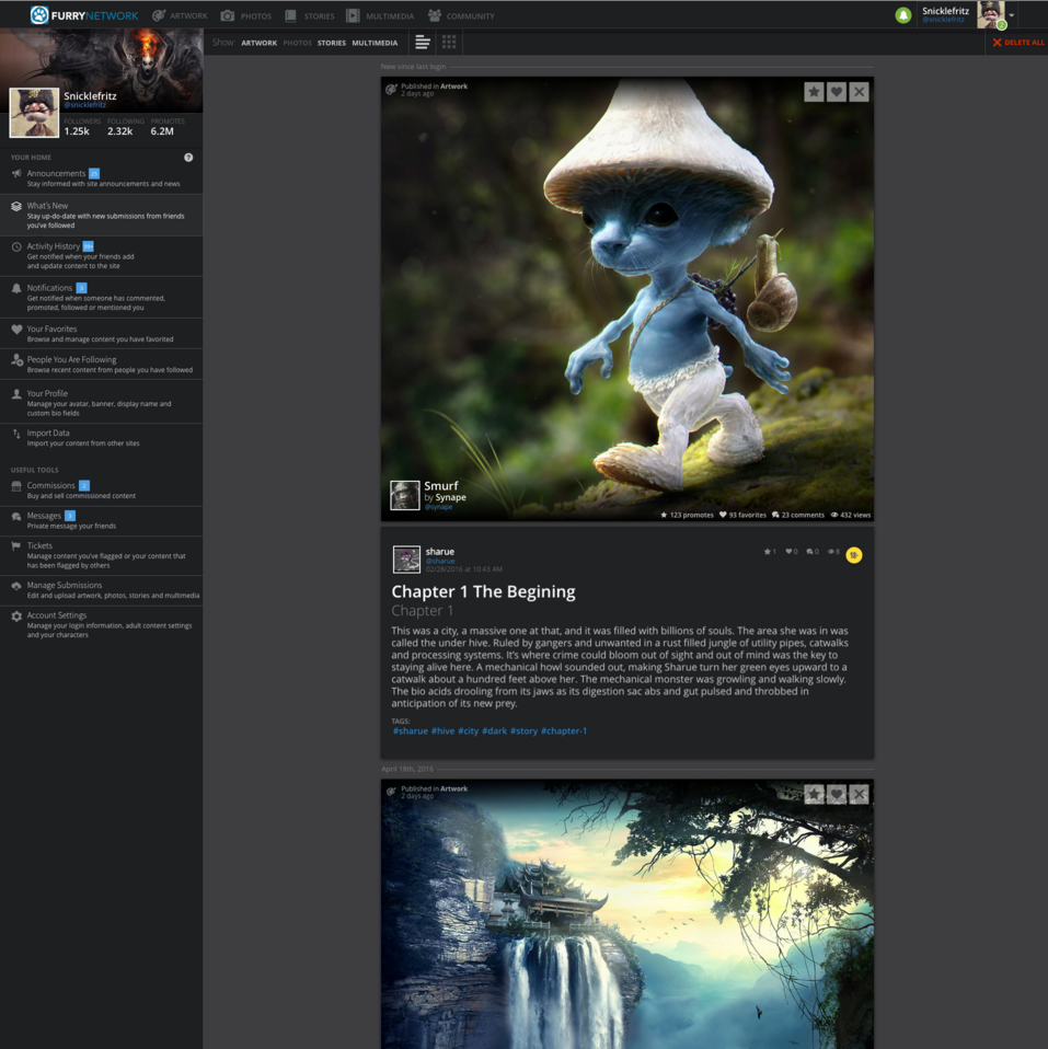
Here's a sneak peek of the reworked interface. Note the 'grid view' button at top, and the full artwork being displayed with no letterboxing or notifications mixed in:
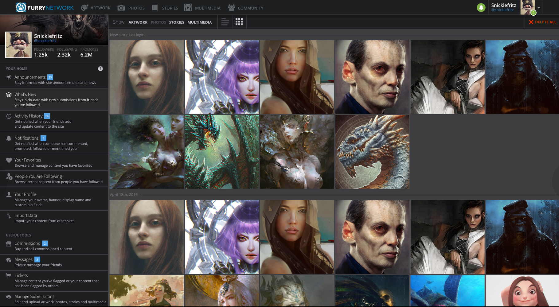
Grid view, of course, is also present - note the dividers between your last visit and older dates, together with notifications being in their own section on the sidebar. This is the screenshot that I got the most excited about:
And finally, the notifications / activity page - where all the other updates about other people go:
We're currently working on coding and finishing these interfaces, but I thought I'd share these early screenshots with you as I expect they'll be as exciting to you as they are to me!
Varka

Looking fantastic! Better than I expected! :D
Only thing I'd like to mention is that the amount of description on the left buttons is a little cluttering (they could instead pop out when you hover over with mouse?) - it makes it hard to quickly glace over the button you're looking for.

Oh wait.. They're WIP shots. Oh well. I'm still excited and can't wait until they are added to the site. :3

Honestly, the organization of notifications is one of the only things I like about Furaffinity. All my new content is categorized and easily viewable.

Hey all,
A few weeks ago we pushed a big update to the feed page, that implemented a lot of the feedback outlined here. As a result, I'm marking this topic as 'completed' - but (because I want to test the 'satisfaction' poll that shows up after something is marked as completed), I'd like to know if you're satisfied with the solution we've created!
Thanks to everyone who contributed on this topic - you were invaluable in improving FN for everyone! Go team!
Varka
Customer support service by UserEcho




Hey all,
A few weeks ago we pushed a big update to the feed page, that implemented a lot of the feedback outlined here. As a result, I'm marking this topic as 'completed' - but (because I want to test the 'satisfaction' poll that shows up after something is marked as completed), I'd like to know if you're satisfied with the solution we've created!
Thanks to everyone who contributed on this topic - you were invaluable in improving FN for everyone! Go team!
Varka