
move comments under artwork
I dont know, maybe its just me but i find myself ignoring/forgetting that there are comments on artwork sometimes. on FA i loved reading comments too see what others had to say but here for some reason it feels like they are almost hidden away(not really).
maybe its just me and i have to get used to the different layout but personally would love to see them under the artwork or have a toggle in my settings to change it.
Cheers
No
Answer

I actually wouldn't mind seeing the whole description with tags, comments, etc. under the actual submission. A toggle would work for me.

As has been suggested, an option to choose where you want to see comments would be a great improvement.
However I have to add on top of that my own suggestion of enabling manual frame resizing so that one can re-allocate screen space to different page elements as they see fit.
More power to the users. and a +1

I have actually had several times where I would've wanted to drag the sidepanel wider to read description better.

Actually, the comment section is a big part of the watcher's "workzone". As a not-content-producing user of FurryNetwork, I'd like to see the comment section a little bit more in the foreground. +1 for that one.

I agree with this personally. Comments and description as they are are very small, minor. It doesn't allow comfortable description or interaction in comments even less so perhaps a short story attached to the image.
I'd like to see either way to stretch the sidebar, or move it down bellow the submission.
I think there's another thread discussing a similar issue, since I remember posting that FN should take a look at artstation who have succesfully made comments stand out and be visible with the same layout, I like the layout where comments are on side since it'd give the ability to make multisubmissions later too.

FN started as an exact copy of Art Station. But the community there have different needs than us. We have YCHs and auctions with large amount of info in the description, we have artworks that have a short story to go with them, and so on. Also, we are much more active in comments in general, and for the already mentioned auctions and YCHs we will need clearly visible and well organized comment section for bidding (unless/until a separate bidding feature is added).

i keep getting lost trying to find the comment section for commenting on an image.
it also looks more organised to me with the info underneeth the image instead of to the side. when it is on the side it looks cluttered

Yes! I agree with this. Personally I would MUCH rather have comments under the artwork and have the maximum width of the artwork fill the whole page. It would be nice if we could see submissions in HD in the submission page rather than having to click on them and bring up an HD viewer to see them fill the breadth of the screen.
Comment sand descriptions squeezed into a tiny area at the screen edge may work for Art Station (Though I dislike it there too) but it does definitely not work for the furry community's needs. For us descriptions and comments are of utmost importance.
I also made a ticket for descriptions under the artwork: http://support.furrynetwork.com/topics/707-/

Not only comments area is tiny, but comments are single-line by default. That actively harms discussion.
I like them where they are, personally I find it works far better on landscape viewing.
If comments were to be moved under the submission I feel that should only be if viewing in portrait mode [either on a portrait angled monitor, or on mobile devices.
We can still see the image fullscreen by clicking on it, the current way seems much more effective for touchscreen device use to me than FA's system.
When a submission has 200 comments, good luck reading that in a tiny narrow column on the side of your screen with a football field size of empty, unused space taking up most of the screen as you scroll down.

Hey all!
Plenty of votes here - would this be best as a "Make it bigger" button you could click on a particular image if you wanted to go through all the comments, or would it be a site layout change that would show for everyone?
What would the layout look like - and how would it work on mobile?
If anyone has some quick-and-dirty mspaint skills, now's your chance to shine and show us all how it might look!
I'd definitely be for a site layout change. A "Make it bigger" button feels like saying "Yeah, we know comments are important, but we're gonna hide them behind this button anyway".
Things to consider for the layout:
Comments should be separated from each other by subtle, little rulers or a boxes around them (like it is in this forum here) to keep everything clean and uncluttered. Currently they are just placed under each other without a clear separator.
The "reply" and "flag" buttons should be always visible (including both, the icon and the text), since the constant show / don't show when hovering the mouse over it and the button extending to show the attached text gets annoying.
Comments that reply to another comment should show explicitly to which comment they replied. The current @mentioning thing doesn't do a very good job in my opinion, especially not for comment chains. Maybe indenting replies would work? Or connect them with thin lines to show who replied to whom, similar to the way Weasyl does it?
The date, like it is currently depicted as "3 days ago" and showing the actual date when hovering the mouse over it, is a good thing and I think it should stay that way. It makes it especially easy to understand how old a comment is if you live across different time zones or in a region that doesn't use the AM PM system.
Add an easy way to permalink to a certain comment.
Maybe highlight the comments of the user who posted the submission among the other comments by color or adding something like "created this submission" or like "wrote this journal" behind the username to easily identify the content creator between other comments.
At this point I'd also like to add that the 1000 character limit for comments should be removed. Splitting longer comments into several smaller ones is not only annoying, but also clutters the comment section up. In addition, there is no counter to show you how much space you have left to write something!
Since I'm not familiar enough with the matter to present a solution for the implementation of those ideas for mobile devices, I'll shut my mouth about it.
I hope these suggestions are something other people would like to see as well, or might give you all some more good ideas to share!
+1 for separation. I know the current design trend is "clean as fuck", with often nothing but white space playing the role of separator, but honestly, that is counterintuitive. It ma look trendy, but sure as hell makes it harder to see what belongs where. Design should never be more important than usability - but then, that is exactly why we ask for comments and descriptions under artwork. :P
+1 for comment nesting and tree lines too. Mentioning serves a different purpose IMO, and the more comments and more replies, the harder it becomes to see what belongs where. Again, just look at FA, huge comment trees are common in this community.
"the 1000 character limit for comments should be removed. Splitting
longer comments into several smaller ones is not only annoying, but also
clutters the comment section up"
^ This
"I'm not familiar enough with the matter to present a solution for the implementation of those ideas for mobile devices"
- Generally, for a mobile layout you want to move everything under each other anyway, since mobile screens are tall but narrow. So moving comments and descriptions under artwork will actually be in tune with mobile friendliness.
I would prefer a permanent layout change to move both comments and descriptions (the latter is the more important) somewhere they have space - and to do that without taking space away from the artwork, moving under is perfect as you can scroll down as much as needed while the width of your screen is limited (and side-scrolling is obviously not a vaild option). Yes, most people have wide sreens nowadays, but it still is limited, while vertical scrolling is practically infinite.
The problem with the "make bigger" route IMO is that it offers a choice between two evils: Make this bigger, but let something else suffer, or the other way around - what if I want to pay attention to everything? With comments and descriptions below, everything always has plenty of space and all you have to do is scroll, which is the easiest form of navigation, instead of locating and clicking a button every time you want to switch between reading comments and for ex looking at the artwork.
Addendum: as far as "make it bigger", once they are moved below the artwork, you can add controls to collapse (and expand) the comments and description sections separately, if you don't need them. Default we start with the artwork occupying most of the screen space, then, we can leave it at that, or, if we are interested, we can scroll down for descriptions and comments.
Collapsing description can be useful if it has a large description, and we just want to see the comments. Because of this, I would place the collapse button on the top of the descr box so as I scroll down I can collapse before having to scroll through it at which point collapsing wouldn't achieve much anyway.
Why do people downvote my addition about collapsing? I really don't get it.
Care to explain why you dislike this?
one theory is that people think it'll make the comments section look like reddit.
personally, i think that people should be less worried about copying from other websites and more about functionality. therefore i actually support the idea of collapsible comments in a similar way to Reddit.
FN is a copy of Art Station. Just saying. https://www.artstation.com/artwork/ZRx3w
BTW I did not suggest collapsing threads, I suggested the ability of collapsing the whole comment and descriptions sections respectively, if you don't want to read descriptions/comments at all.

LOL. If it's a copy, it's a bad copy. ArtStation's navigation (shortcuts, going back) and design (more space for descriptions) are better.
If you open that link you will see comments and descriptions are forced into that small area on the left, just like FN right now. This is what may work for AS but is not suitable for the furry community.
[Meant to place this as a reply here.]
This may sound silly at first but I think it could solve this really well visually and functionally:
Give comments and the art their own tab within a submission.
On tab 1 you have just the art taking up the full screen space, on tab 2 you have the comments [could also put the tags and description here perhaps.]
Doing this you have the maximum space for the image, it reduces data downloads for users by not needing to download user icons unless you open the comments tab, it leaves plenty space for a well formatted comment section.... just seems win win to me.
It would also make sure we don't end up with the FA situation where jerks post long strings of letters and completely bork up the page formatting XD
The problem with tabs is the same as with expanding: You have to find the tab and click it every time you want to look at the description/comments/art. If description/comments is under, all you have to do is scroll your mouse up and down, it couldn't be any simpler and more convenient than that.
As for "jerks posting long strings" no, this is not how you solve that. You solve that by not writing shitty code. FA's comment section is screwed up because the coding is horrible, and not because of the layout.
The way comments are implemented right now screams "COMMENTS ARE GARBAGE". They're single-line, limited to 1000 characters, not threaded, put into a tiny space which is close to impossible to navigate. If you leave comment design this way (I'm not just talking about side panel vs below image, I'm talking about all issues), it'll harm community. The harder you make commenting, the less people will bother to comment; the harder it's to read them, the less people will read them, the less people will be motivated to comment.
The first problem with the side panel is that it's tiny. You try to fit all content into it. Look at the pages on FA. On popular submissions, comments are 80% of content, often more. And you're trying to fit 80% into 20%. It's impossible.
The second problem with the side panel is that you try to fit multiple, very different usages into one design. What usages?
1. "I want to just view images." People who want images and nothing else. Go to DeviantArt, open any image, press Left and Right buttons. Notice that image is always loaded first, you can quickly switch between images and browse the whole gallery this way.
2. "I want to evaluate an artist." They want to switch between popular images of an artist, they may look at titles and maybe descriptions.
3. "I want to devote some time to this image." They want to read title and description, discuss art in comments.
Your current design tries to do everything and fails at every single task.
1. People who want just images can switch to full view, but can't navigate in this mode.
2. People who want to naviagate a gallery, get navigation at the very bottom of the side panel, they have to scroll it every time.
3. People who want to read and discuss... well, they get the shortest stick. It's close to impossible. Title area is tiny, without wrapping. Description is collapsed and tiny. Comments are barely usable.
Overall, the current design is currently the worst that can be imagined. It doesn't do a single thing right.
As far as comments go, there're many obvious suggestions already posted here: increasing character limit, threading etc. I don't think I've seen complaining about single-line comments by default, but if there isn't, I'll create it. Overall, just moving comments below isn't enough. If you want activity of viewers (and many artists consider this one of the most important factors), you need to fix a lot.
https://support.furrynetwork.com/topics/289-/
https://support.furrynetwork.com/topics/455-/
etc.
If you want my opinion on design, I think comments should be moved below the image. Permanently, no switches. There's enough content for the side panel already, more than enough actually. You've made title and description unreadable and navigation barely usable. If you want them to be useful, you should let them occupy more space. See https://support.furrynetwork.com/topics/1006-/ for more details on rearranging content in the side panel.
There's also a suggestion to move description below image (see https://support.furrynetwork.com/topics/707-/). Considering descriptions vary from artist to artist (some leave them empty, some put stories there), I think a switch "side panel / below" would be useful. It'll also satisfy people both in categories #2 and #3 described above: either navigation or titles+descriptions could be prioritized, depending on preferences at the moment.
And finally, regarding people from category #1. While it's not top priority, navigation like on DA could be useful, with inheriting submission list and sorting from searches and galleries, maybe with hiding side panel completely.
On most of this text wall's points I agree, but two things are wrong apart from the obvious anger it's filled with.
first, you must have missed the navigation feature right below the image. and while it's limited, it's there. additionally, not every art-focused website even has the feature you're talking about. I know DeviantArt has it, but FA and WL do not.
secondly, it's not close to impossible to write a comment. you just scroll down a little bit.
with all that said, I still stand by my previous suggestions of releasing the locks on the in-page borders so that people can adjust the sizes as they see fit.
I would also like to add that most, if not all, suggestions are things that I am very much looking forward to; comments below image, threaded comments, ect. even options to switch panels on or off and other UI customization options.
The reason for anger is that FN tries to be "new FA", yet it's more like "new Tumblr". If it succeeds in overtaking FA (of which I doubt, but whatever) without improving basic socialization features like commenting, it'll harm the community, and that's something I want to avoid.
Haha, I see this navigation now. I missed it because I always open images in a new tab, and in this case navigation doesn't appear. The reason for opening in a new tab is obviously the fact that back button isn't supported in the "endless" scrolling. And I just like separate tabs. So, this feature is totally useless for me in its current implementation. Also, this navigation is partially duplicated by navigation in the side panel, which isn't good.

I support this.
It's kind of distracting having them on the side.
I would guess we're all so used to having them under everywhere, some of us for more than a decade, that it's just hard to get used to having them somewhere else.
It's not just being used to, but it is the only logical layout if you consider comments and descriptions important content - and in this community, they are. Sidebars are for secondary things like navigation links, tags, and so on.

I really like how comments display on Posts/Story submissions. (example) The layout feels very clean in comparison to other submissions, it could serve as a great starting point for a more unified submission page layout.

How about this:
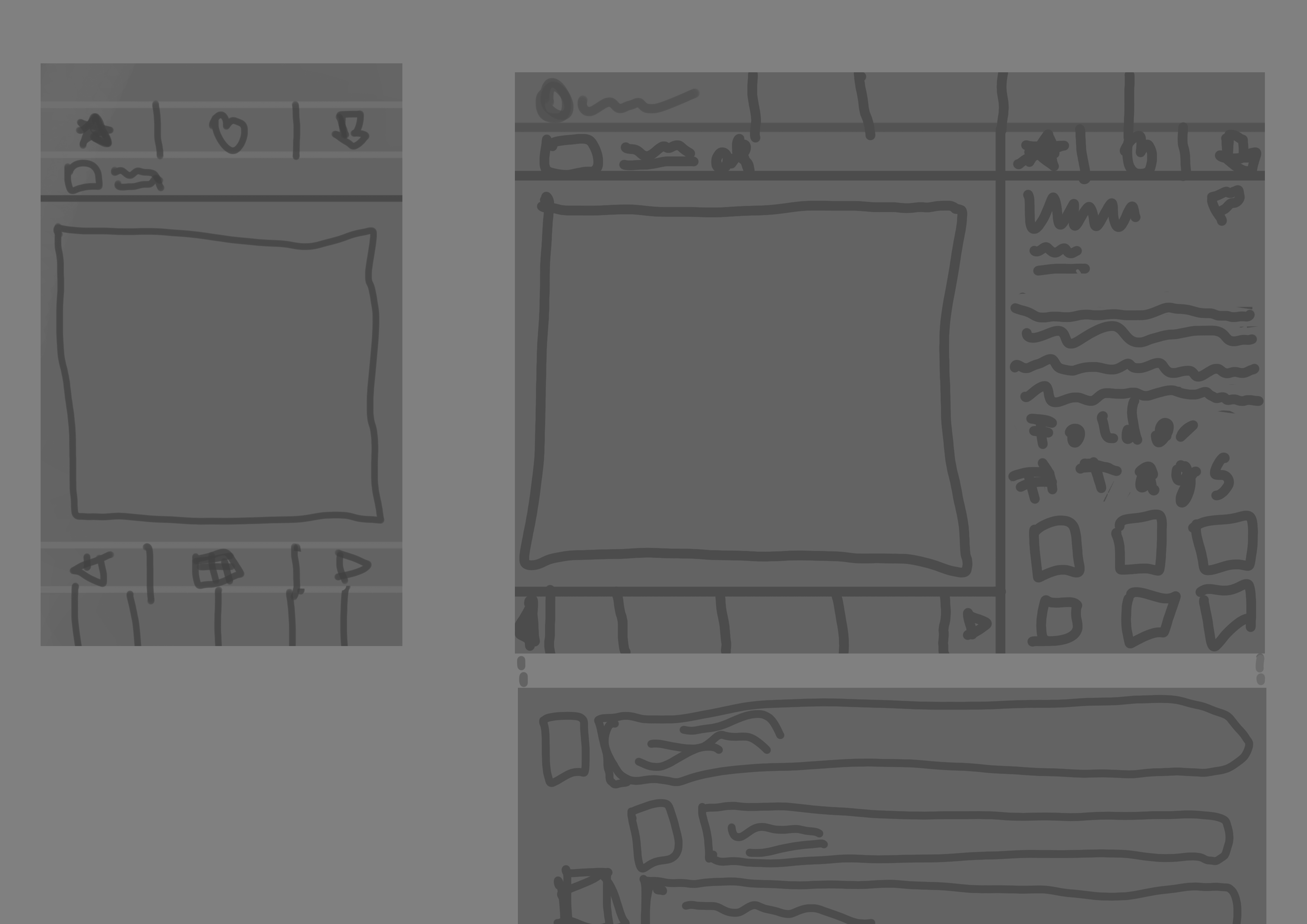
Mobile:
- Make the "< # >" wider, and the "#" a bit smaller so Everyone can hit the Button (with One-Hand or Two-Hand)
- So you can put the author at the top, maybe at the right align
- I think the TabBar is ok (maybe a little bit higher?)
- if you scroll down the Comment can load later, if you are at the top no comment must be load
Desktop/Tablet?:
- if the Comment are at the bottom the focus is more at the Content
- if you scroll down the Comment can load later, if you are at the top no comment must be load
- The "Other Artwork" (Maybe max. 3, 6-9 Items), "Folder" and "Tags" are at the right-bottom, so more space for the Description
- 4-5 Items for the the next/prev Preview-Art are fine
Nice Nerd Stuff for Developer:
Customer support service by UserEcho

Hey all!
Plenty of votes here - would this be best as a "Make it bigger" button you could click on a particular image if you wanted to go through all the comments, or would it be a site layout change that would show for everyone?
What would the layout look like - and how would it work on mobile?
If anyone has some quick-and-dirty mspaint skills, now's your chance to shine and show us all how it might look!