 Bugs
Bugs
Trigger of Mobile Design might not wanna happen on a Desktop Browser at 1034 × 578
Another quick change request that might interest many.
I am running a FullHD Monitor, and I tend to work on two windows at the same time. Now, the moment I set the Browser Window with FN to half the screen width, it is set to the mobile design which is absolutely nonsense as there is still plenty of space
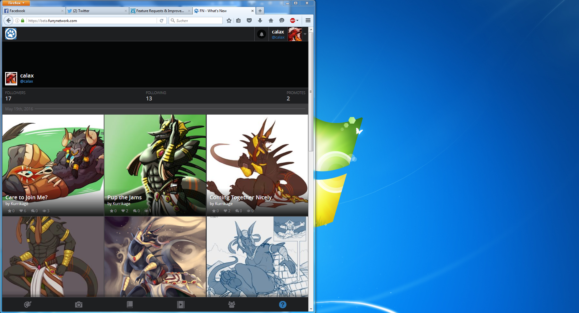
It should be possible to easily fit the Desktop Version onto this resolution.
I also bet that people with Monitors of a Res of 1024x768 also wanna have the Desktop Experience (Be it the Main or Second Monitor).
I do think that this is a bug, and thus i will set it into that Category
Answer

This appears to be the way that the website should be functioning. When it becomes that narrow, the menus on the left and right take up a great deal of space, and it's much more difficult to use with the normal layout. This layout change allows you to see higher resolution images, especially after clicking individual images, while still having access to other features on menus.
Customer support service by UserEcho

This appears to be the way that the website should be functioning. When it becomes that narrow, the menus on the left and right take up a great deal of space, and it's much more difficult to use with the normal layout. This layout change allows you to see higher resolution images, especially after clicking individual images, while still having access to other features on menus.