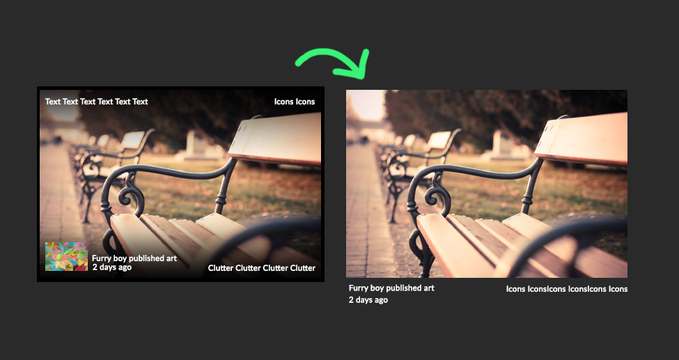
To be honest, I would like that awful black gradient removed from everything— Profile banners, thumbnails, feeds... It doesn't unify the viewing experience. It negatively impacts how we view artwork by obscuring a section of it. That doesn't encourage people to view the individual page, but rather ignore it entirely because the first impression has already been ruined.


That actually makes a lot more sense, but it would take more space. Maybe an ability to switch it in options?
I would love for it to be default. I personally would hate to see my own art obstructed by all the clutter on top.
To clarify I'm referring to posts in User profiles, not thumbnails in the Artwork, photo tabs etc.
To be honest, I would like that awful black gradient removed from everything— Profile banners, thumbnails, feeds... It doesn't unify the viewing experience. It negatively impacts how we view artwork by obscuring a section of it. That doesn't encourage people to view the individual page, but rather ignore it entirely because the first impression has already been ruined.
Yeah, probably that would look much better.