
Removal/revamping of nonessential interface elements. (Less Flashy, Less Clicks, UX design)
To be blunt, I feel this site is too bloated with 'modern aesthetic' and it interferes with actual functionality.
I'd rather my inbox not have a black gradient over the bottom of every thumbnail and that the images just load without motion or fade. It slows the site for no added benefit beyond 'wow look what we can do'.
Additionally, application of UX web design would help a lot.
Currently:
Clicking the name in the top left, clicking my own name in the top right, as well as 2 "what's new" buttons that ALL lead to the same place. While submitting an image is 2 clicks (any 'rival' sites I can think of use 1)
There is an all in all easy solution to this, in my eyes.
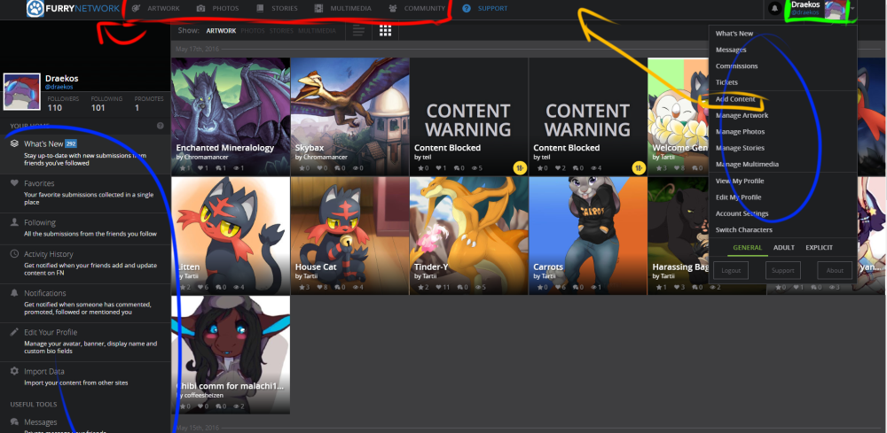
Red: Make clicking on the site name take us to the site-wide listings. Clicking a websites name taking you to a non-personal homepage seems more intuitive than your inbox. You already have a secondary bar for filters, surely this can be used on the 'front page' too yes?
Yellow: Move 'Add Content' to the main bar, along with a 'What's New' button if you really want?
Blue: I realize this is only for your inbox screen, but it feels extremely, almost pointlessly redundant. This one I do not have an answer for right now; but I feel the left side menu's space could be better used somehow.
Green: Clicking this should take you to your own profile. Like mentioned above, this feels like simple intuitive design. Perhaps make the arrow on the right larger and a unique element?
As a side note, the popdown list of 'related' suggestions that you need to click a specific button to remove also feels a little forced. Clicking off the Header entry bar anywhere else on this page should dismiss that. Then again, that seems to be a common trend with any support form system.
All in all, this site has potential, but I feel like we're getting more fancy than function. Being able to opt-out for the superfluous visuals would be nice. And more care for navigational efficiency feels very needed.
Customer support service by UserEcho

I agree on most things with this - navigation is rather unintuitive here. Although there's a few things that you missed:
1. the dark gradients are there because it helps display the white text which IS nessecary and useful - with proper coding a single gradient shouldn't take too much efficiency away (the thumbnails loaded super slow before the gradients were added too, so thumbnail loading slowness is surely caused by something else).
2. It's fairly normal and intuitive to have a dropdown menu from your name/icon button when it's on the top bar, I think it's good.
3. I think there should be an entirely own frontpage for FN when you click the logo, could easily have staff picks, news and other things like that there.
4. Add content + whats new button could easily fit next to yourname button on the right side of the panel, while still keeping the categories there.
1: One would then argue, perhaps, that slapping the text into the thumbnail is perhaps not the best idea. I'm actually not fond of it as a while, but I think I'd rather a border around the text rather than a gradient. Personal taste though on this front, I understand.
2: This is why I was suggesting leaving the arrow pulldown. Perhaps arrow and icon brings the menu but clicking on the @[name] next takes you to your profile page? Either way having the option half way down the menu seems counter intuitive to me.
3: I agree completely, it's why I'm saying the 'public front page' buttons should all be compressed down into there. They already have the Show [options] bar. It's extremely redundant to have it twice right ontop of each other.
4: While I agree, point 3. I feel that having those options up there are just taking space they shouldn't need to be. White (nay, dark grey) space isn't a bad thing.
What I'd like to see is the (circled in blue) Nav bar available on all pages, especially with the option to change the desc from 'Full' (as it stands) to Icon and/or Title to minimize it's use of space.
This would be handy even/especially in the areas of the site shown below the 'Useful tools' bar on the Nav menu.
an open/collapse arrow for everything from 'tools down' would he handy for the casual browser.
I can browse FA, e621, and many others fine on my ancient Netbook. FN makes my dual Xeon with 96GB RAM actually work more to display a single page, than the hundreds of other tabs I have open. Only the YouTube tabs with videos are using more resources.
I've been using the site for a little while since yesterday and so far all the fancy Web2.0 stuff is indeed fancy, but it really annoying to browse and the flashy effects like fade in is making my eyes hurt. Likely won't spend any more time using FN beyond curiosity at this stage of development.
The site has undergone some significant redesign - the left menu can be collapsed to make it simpler, and the menu when clicking the setting button at the top-right has been cut down. We're at the point where the basic layout is more-or-less finalized, and we're working with additional features and changes.
Thank you for sending these suggestions earlier, and I hope this can fit most people's needs.
I haven't touched the site in about a year and honestly it seems no different.