Improve the screen to add community tags
First off, the community tag system is a wonderful idea! But I think I found a way to improve it still.
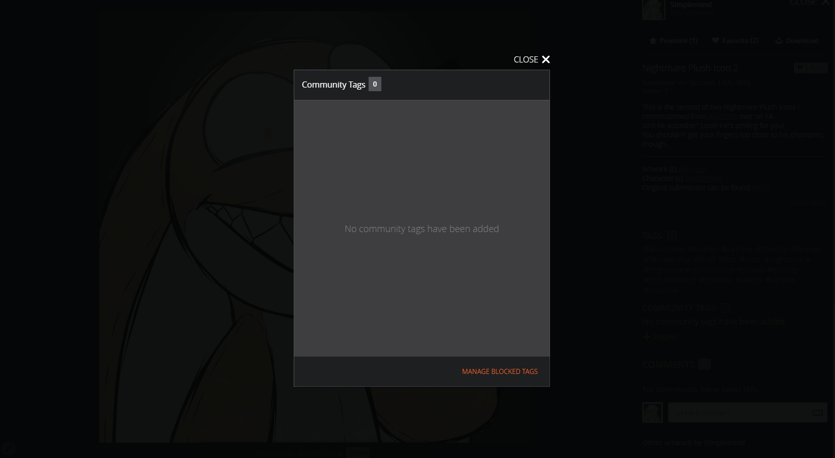
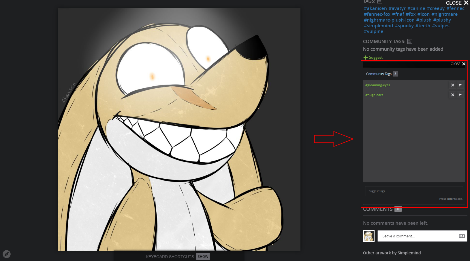
When you hit the button to add community tags, the page you currently view grays out and the community tags interface appears. Now it's hard to add tags when you both can't see the submission in question and the artist tags to see what is already added. My idea would be to be able to use the community tag interface and still be able to see the submission and artist tags unobscured. To achieve this, the interface could appear directly in the side bar, instead of being a pop up. Below is one screenshot with the interface obscuring the submission, and another one where I photoshopped the interface into the side bar. I hope it helps to visualize what I mean!
Obscured:

Community tags in side bar. Everything is visible:

Customer support service by UserEcho


I agree that this would help make this look cleaner. However, this would also take a good amount of coding for something that's rarely used at the moment. If there is more demand in the future, we can look into what coding would be needed to change this.