
0
Completed
Useful Tools menu is way down there! Potential UX improvement.
Have a look at this screenshot.
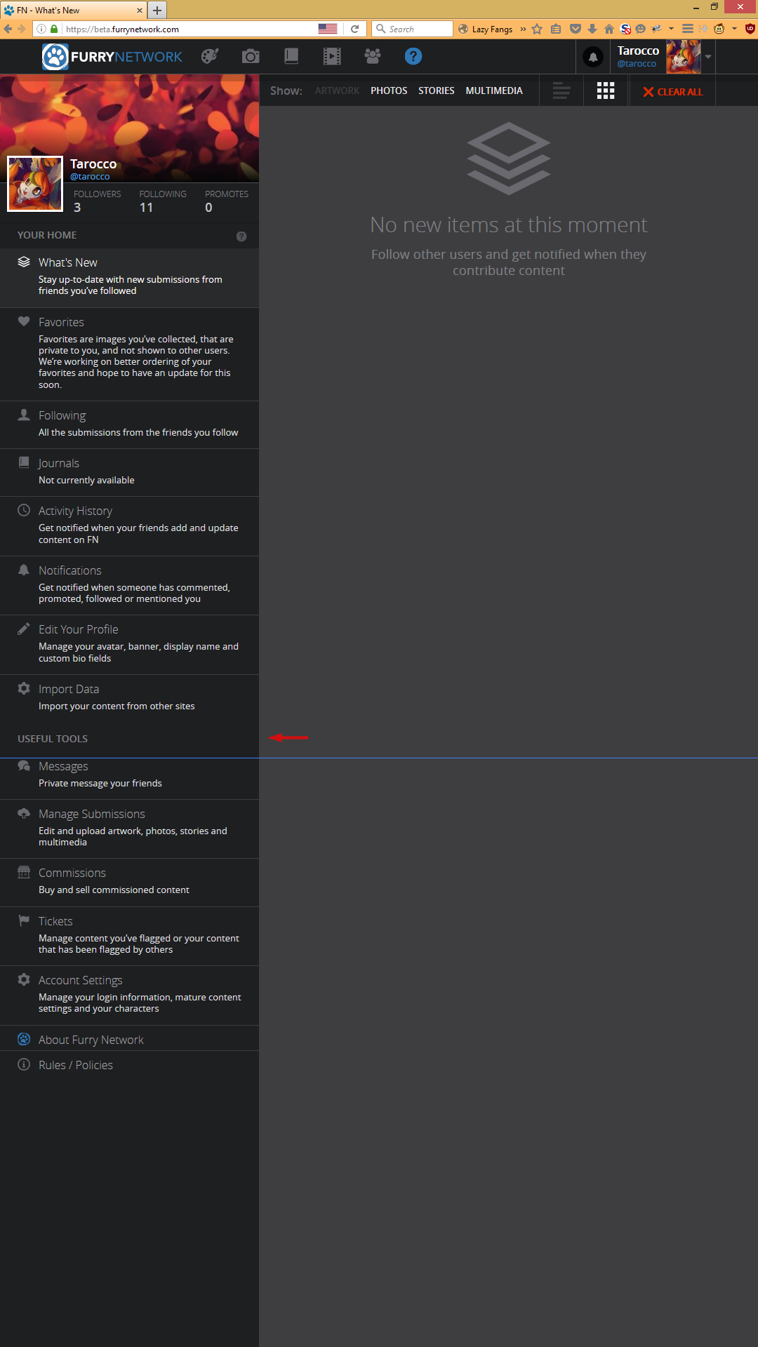
These tools are too useful to be all the way down there! They deserve more love in the upper half of the screen. The blue line shows the 1080px mark. I almost didn't know where to find the options on this page!
But it appears that these options are also available in the user nav menu.
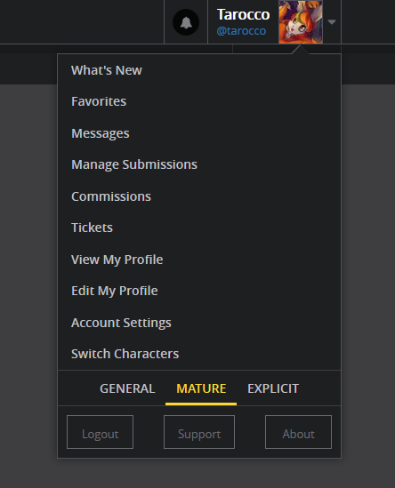
MYTH BUSTED🐰
Customer support service by UserEcho

We've had some changes to the site; at this point, the tools are only listed on the left side of the screen. In addition, there's the option to toggle the descriptions of those tabs on or off. This makes the menu much more compact.
I think the toggle isn't super obvious right now - clicking the question mark at the top of the left menu closes the descriptions. I'll be checking with development later to see if we can make it more obvious.