 Ideas
Ideas
Mobile Web App Support
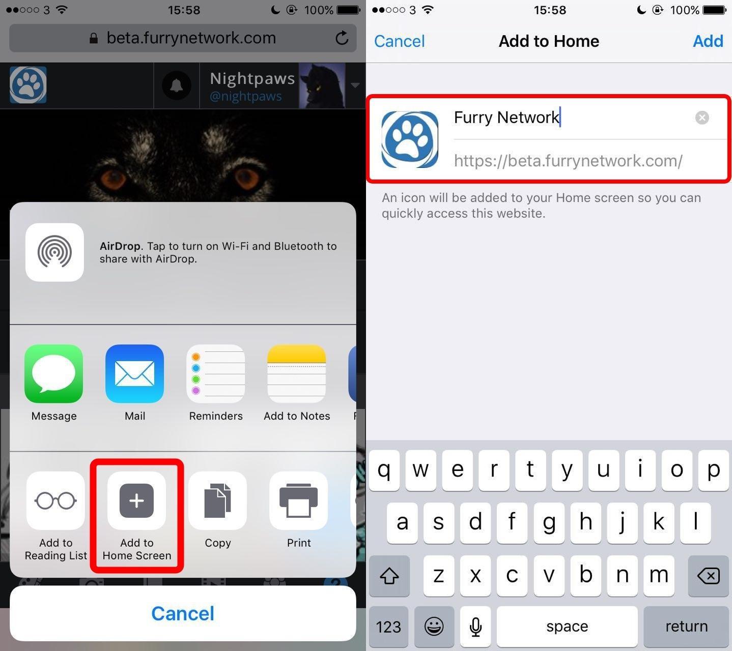
By making a few changes to the HTML of the website and adding an app manifest file, it would be possible to use the existing website as a mobile application on iOS and Android based devices.
This would allow avoid the need to build a mobile app in a native language, and skips the need to comply with Apple/Play Store regulations. Instead a user simply opens the page in their Safari/Chrome browser and chooses "Add to Home Screen", the user can then specify a custom name for the app, tap add then have the app appear like any other on the device.
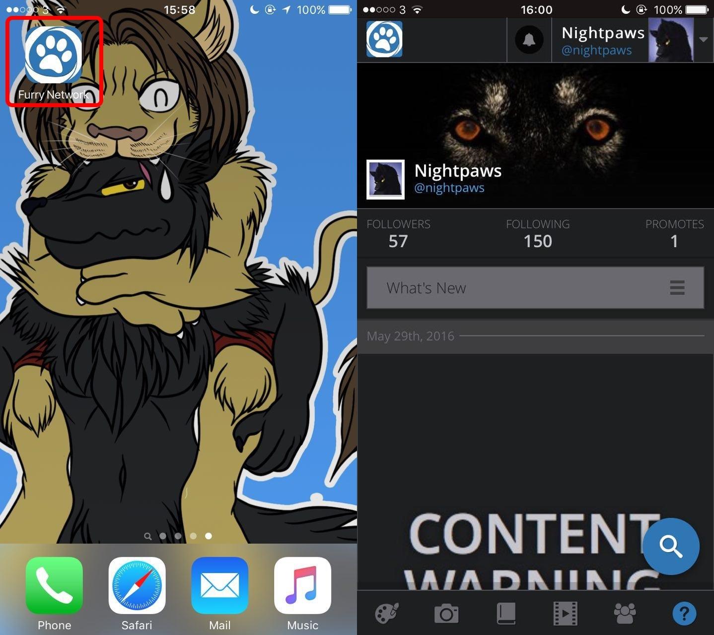
With the correct manifest and metadata the app will run as if it's a native application and run in full screen mode too. Optionally, with some modification, an offline mode could also be incorporated into this design too allowing, say for some sections of the site to be saved to a users device.
Here's a few screenshots detailing the process and a mock-up of the end result:
Other features that can be added using this technique include styling the application window in Android to give the surrounding window a matching colour in the app switcher, and custom app icons to suit the varying resolutions of android devices too. I would show this in screenshots but I haven't got my old phone to hand right now.
Answer

Ooooh, this is very interesting - do you have any idea if the user experience is equivalent to this on Android? In particular, the 'full screen app' part.
In addition, do you have any links you could provide with more information on the user experience and implementation changes that'd be required? This is something that would be really handy for FN.
Thanks!
Okay! So I have an update to this since I'm now (at last!) back in front of a computer. In terms of changes to the system as it stands, only minor additions and alterations between the <head> tags should be necessary. The following tags are generally how I do it:
<!-- Initial flags for browser -->
<meta name="viewport" content="width=device-width, initial-scale=1.0, maximum-scale=1.0, user-scalable=no">
<meta name="mobile-web-app-capable" content="yes">
<meta name="apple-mobile-web-app-capable" content="yes">
<!-- decide an appropriate hex colour for the borders on Mobile Chrome below -->
<meta name="theme-color" content="#1e1f21">
<!-- Covering the bases serving mobile app icons -->
<link rel="icon" sizes="192x192" href="image/advertise-4x.png">
<link rel="apple-touch-icon" href="image/advertise-4x.png">
<link rel="shortcut icon" href="image/advertise-0-75x.png" type="image/x-icon">
<!-- Finally, linking to the manifest file for configuration -->
<link rel="manifest" href="manifest.json">
The above code is roughly what I would use to serve up content that should run on pretty much anything capable of running the site itself. This should cover all current and past smartphones on iOS and Android. An example manifest file can be found here.
This allows the functionality to operate as described in my opening post, however far more detailed implementation is possible right down to specific types of device if you find a particular issue, or want to override behaviour on particular platforms.
Here's some documentation detailing the iOS functions:
- Specifying icon (apple call this a web clip)
- Viewport configuration (Should already be fine but for reference)
- Customising iOS Status Bar preference (My code hides it but you can change the colour of it instead to give more screen space)
And here's some for the android equivalent and additional options:
- Install to Homescreen Info (explaining mobile web apps)
- Explanation of AppCache function (use caution with this)
- Android Splash Screen functionality (Google's preferred design)
The only thing to look out for when doing this is that if a user is forced into a new tab (like these links will do as I've checked the box), it will move them to their browser in the same way that opening a link in Twitter/Skype/Email/Messages would do.
interestingly the mobile web app software already has the function in place but because it opens things in new tabs it doesn't really work too well.
Support software*, not web app software… My mind is all over the place tonight.

As far as Makes can remember, adding <meta name="mobile-web-app-capable" content="yes"> Open separately from Chrome. I wish there was a way to force this without the website adding first. It's super annoying to click an app icon and have double menu bars at the top.
The user experience between OSes is very similar. The only notable differences being that Android devices can colour code their border (not featured in OSX) and Android users can have a splash screen for the 'app' displayed on launch. I believe this behaviour can be disabled but at the very least it can be modified to better suit the app.
In terms of browsing the website, the user experience is identical to using the existing Safari or Chrome browsers but with more screen space available.
I can provide sample code for doing this and links to references in Android and iOS documentation but that'll need to wait until I return home on Tuesday as I'm writing this in an airport departure lounge.

I use an android and for certain apps I don't want anyone to open, I make the icons transparent and make sure they are as close to the edge of the screen as possible.

I'm trying to figure out... how is this related to the topic, please? :)
Customer support service by UserEcho

Ooooh, this is very interesting - do you have any idea if the user experience is equivalent to this on Android? In particular, the 'full screen app' part.
In addition, do you have any links you could provide with more information on the user experience and implementation changes that'd be required? This is something that would be really handy for FN.
Thanks!