
+39
Under review
Notification Icon Changes
Here's one possible way to make the notifications area more functional for users:
Separate notification icons for:
- Comments
- Notes/personal messages
- Content from people you watch
- Favorites and watches
This is necessary because comments are a much higher priority for users to keep track of and respond to, but are highly outnumbered by favorites; the notifications you care about will get lost in the noise of people favoriting your artwork.
Alternatively you could make the notification icon a hover-over menu like this:
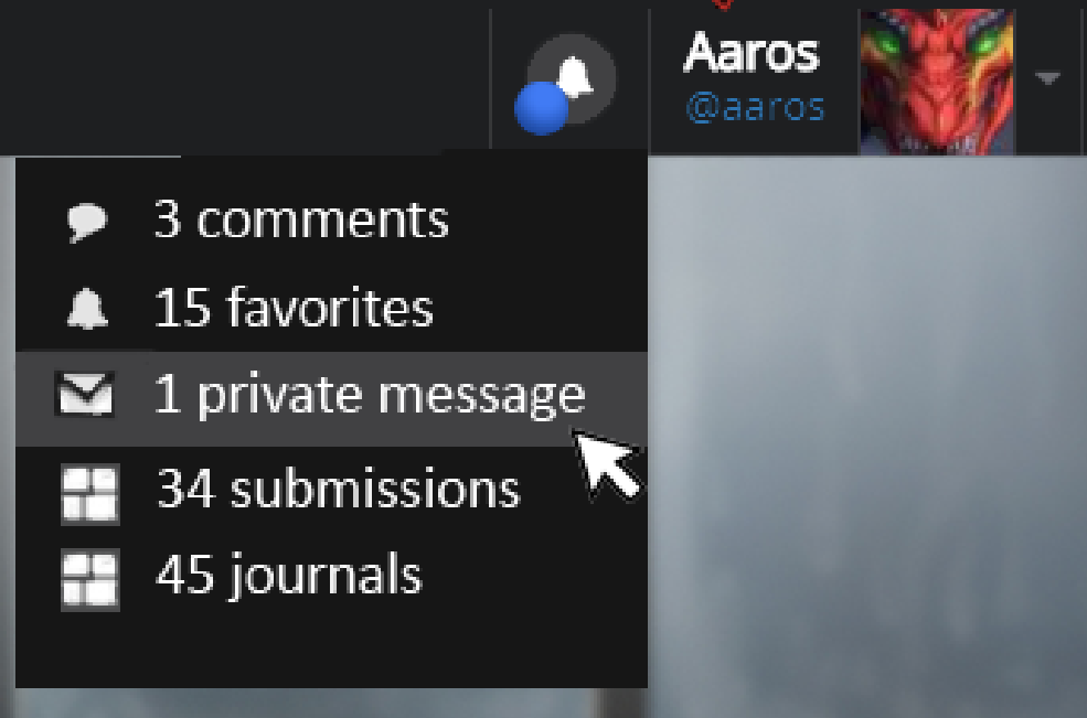
(excuse the crudeness of the design)
Duplicates
1
Customer support service by UserEcho

this! also provide filtering by type of notification in the notification view itself:
I've posted some similar suggestions that would also improve this same issue:
http://support.furrynetwork.com/topics/184-notification-categories/
http://support.furrynetwork.com/topics/92-highlight-unread-notifications/
Tho I don't like the dropdown notification how it is right now, it'd be much better if it showed the number of different new notifications like you suggested (atm I don't even use it because no way to tell how many new notifications and which are new)
well it looks like some things here should be merged :P
I don't think so, I haven't seen suggestions that cover exactly what I'm suggesting here elsewhere so far
Agree 100%!
I really need separate notification types, there's just too much clutter to filter through atm.
We've been having discussions about the way to help users see notifications they care most about; this might be the easiest way to do that. We'll be talking to the developers in the future to see what's reasonable.